The Strong Museum

The strong
national museum of play
CLIENT
The Strong National Museum of Play
dESIGN TYPE
Branding Identity
rOLE
Designer, Researcher
aUDIENCE
Visitors to The Strong Museum
SUMMARY
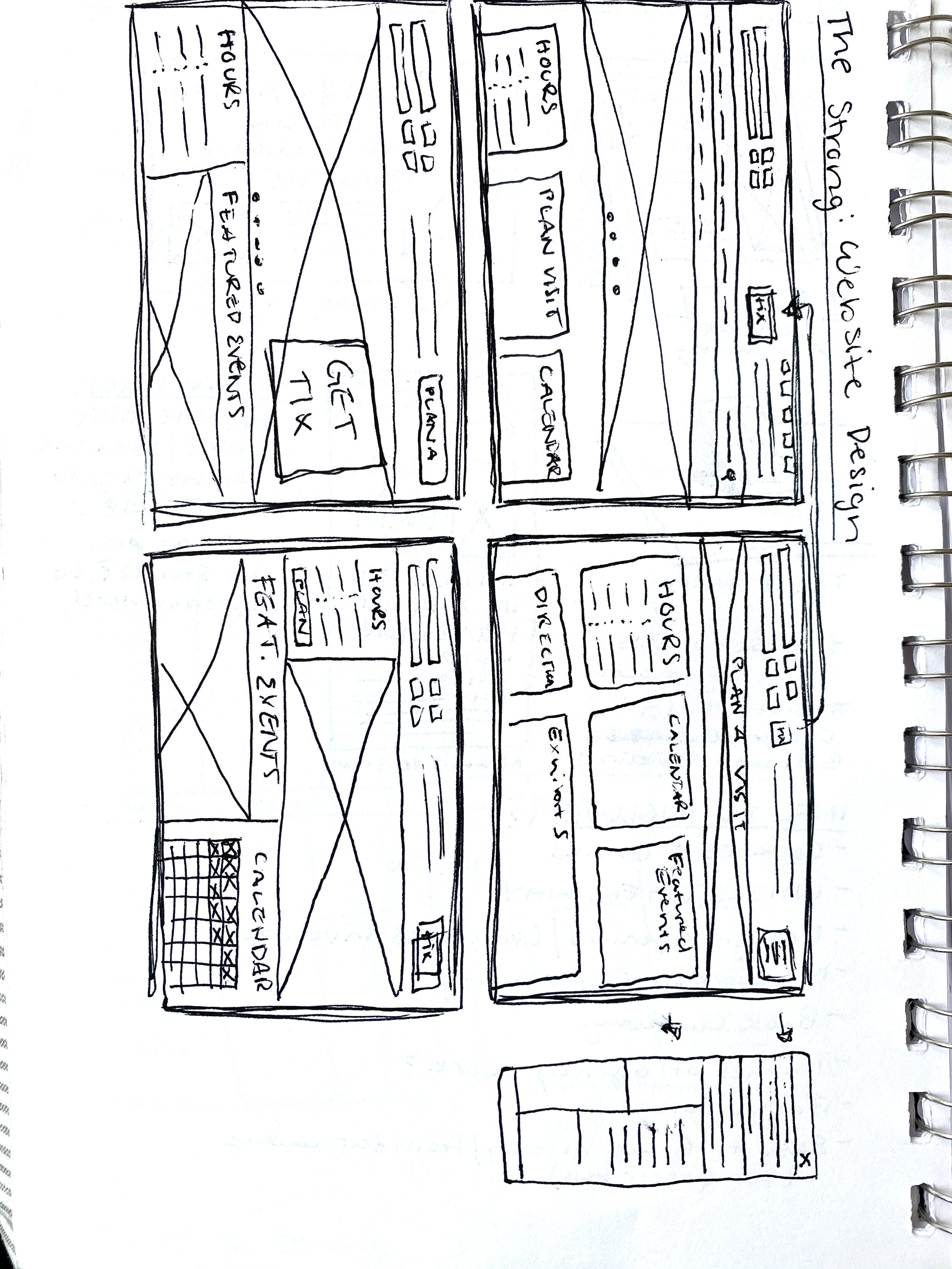
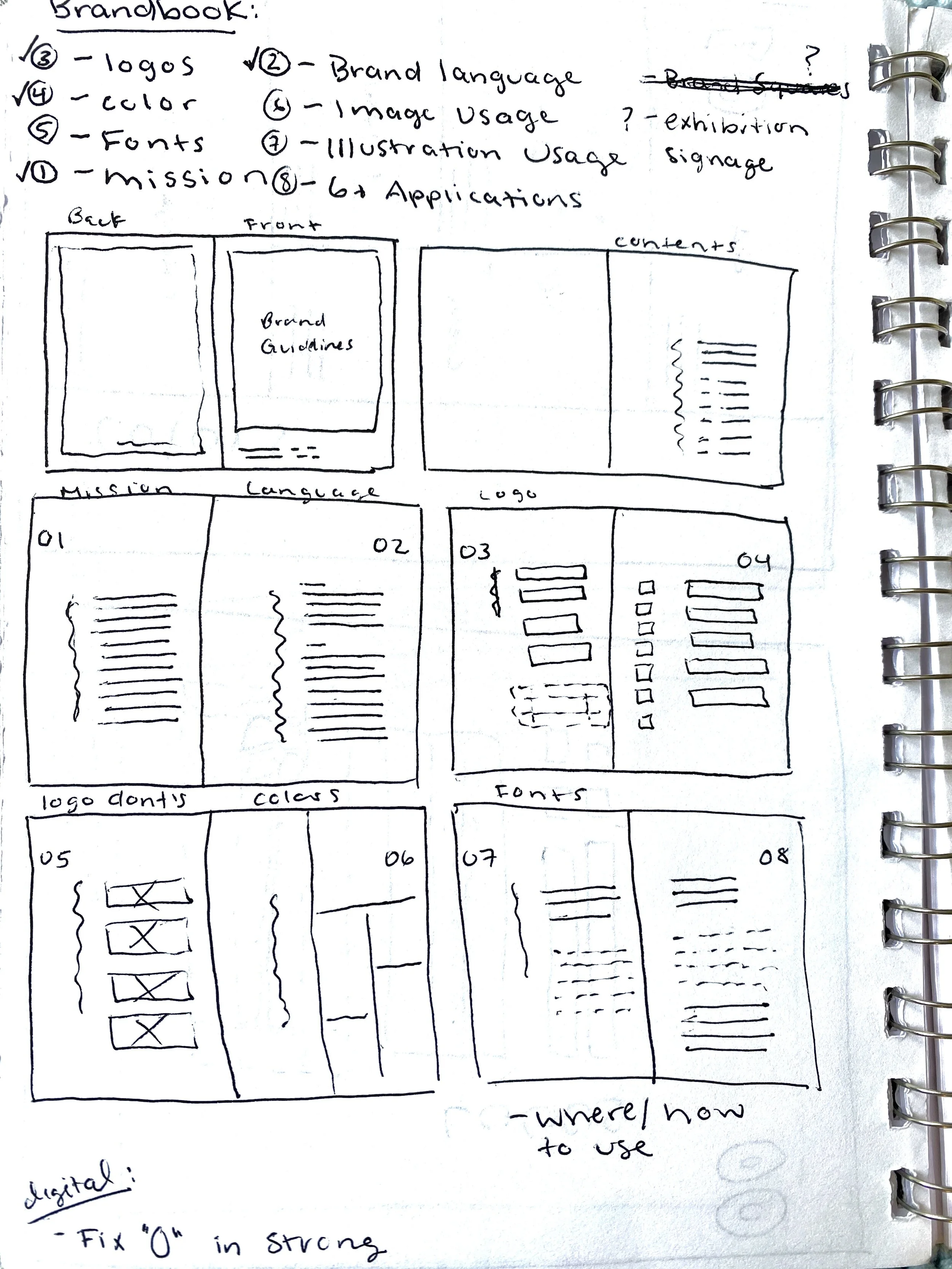
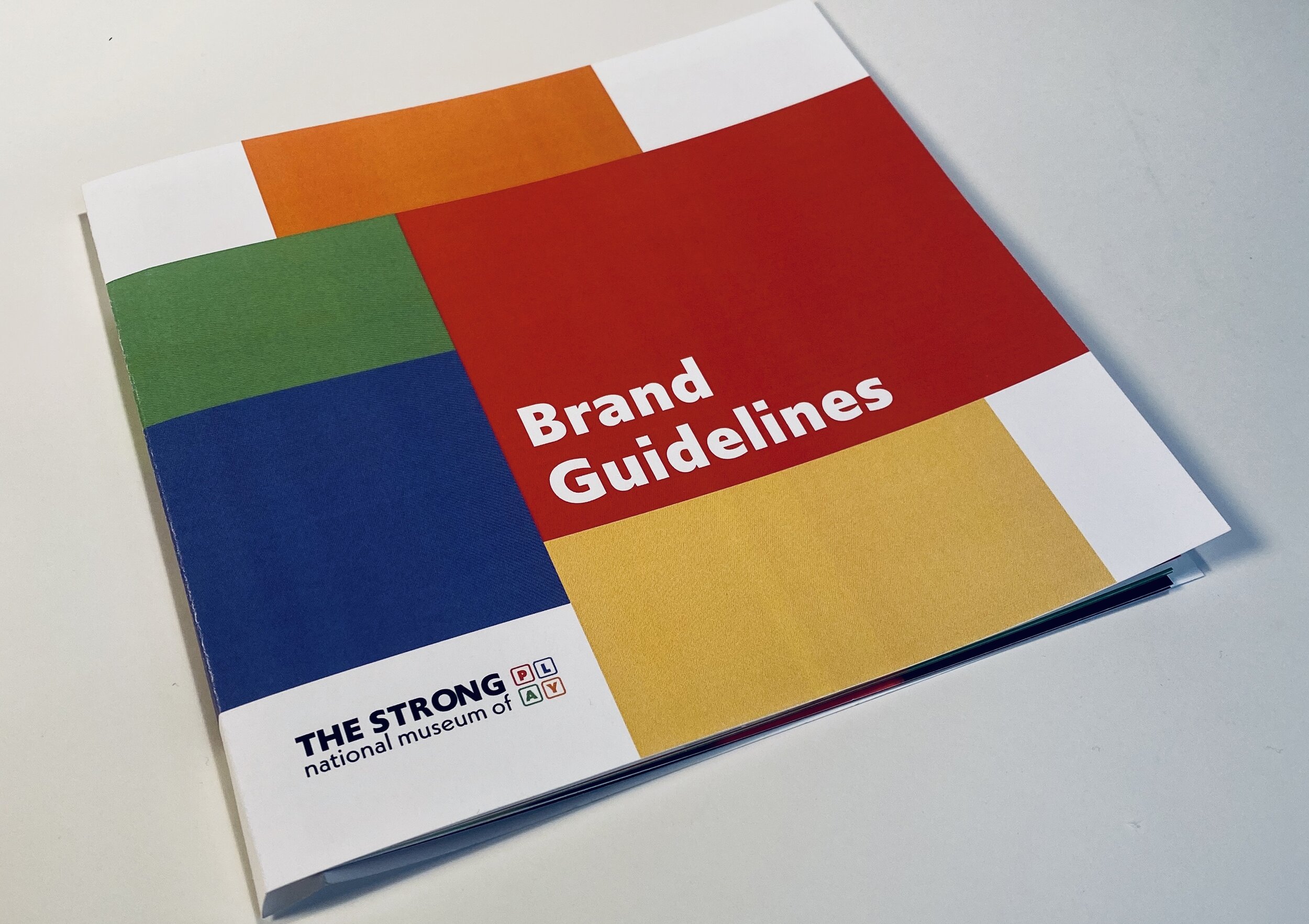
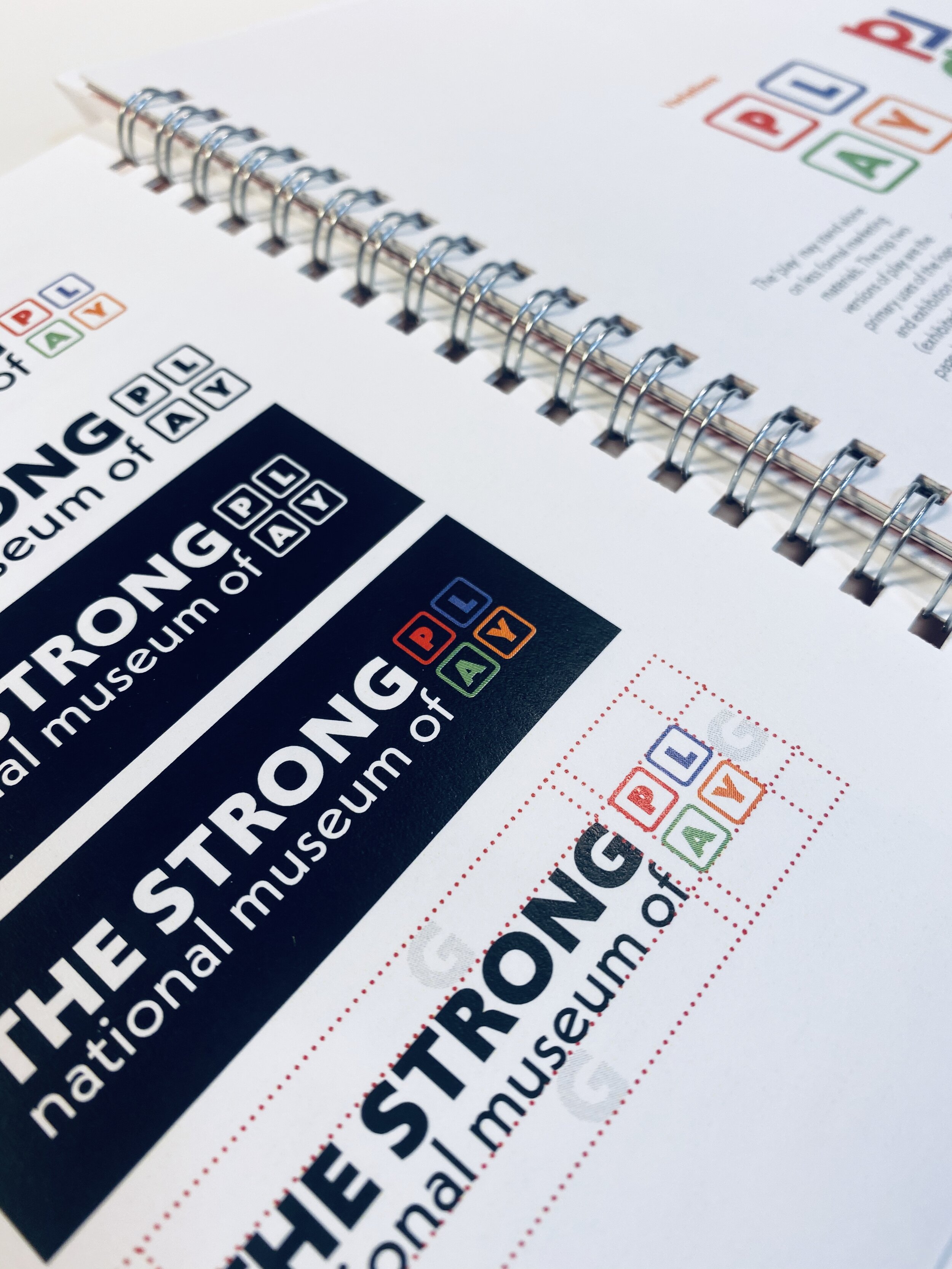
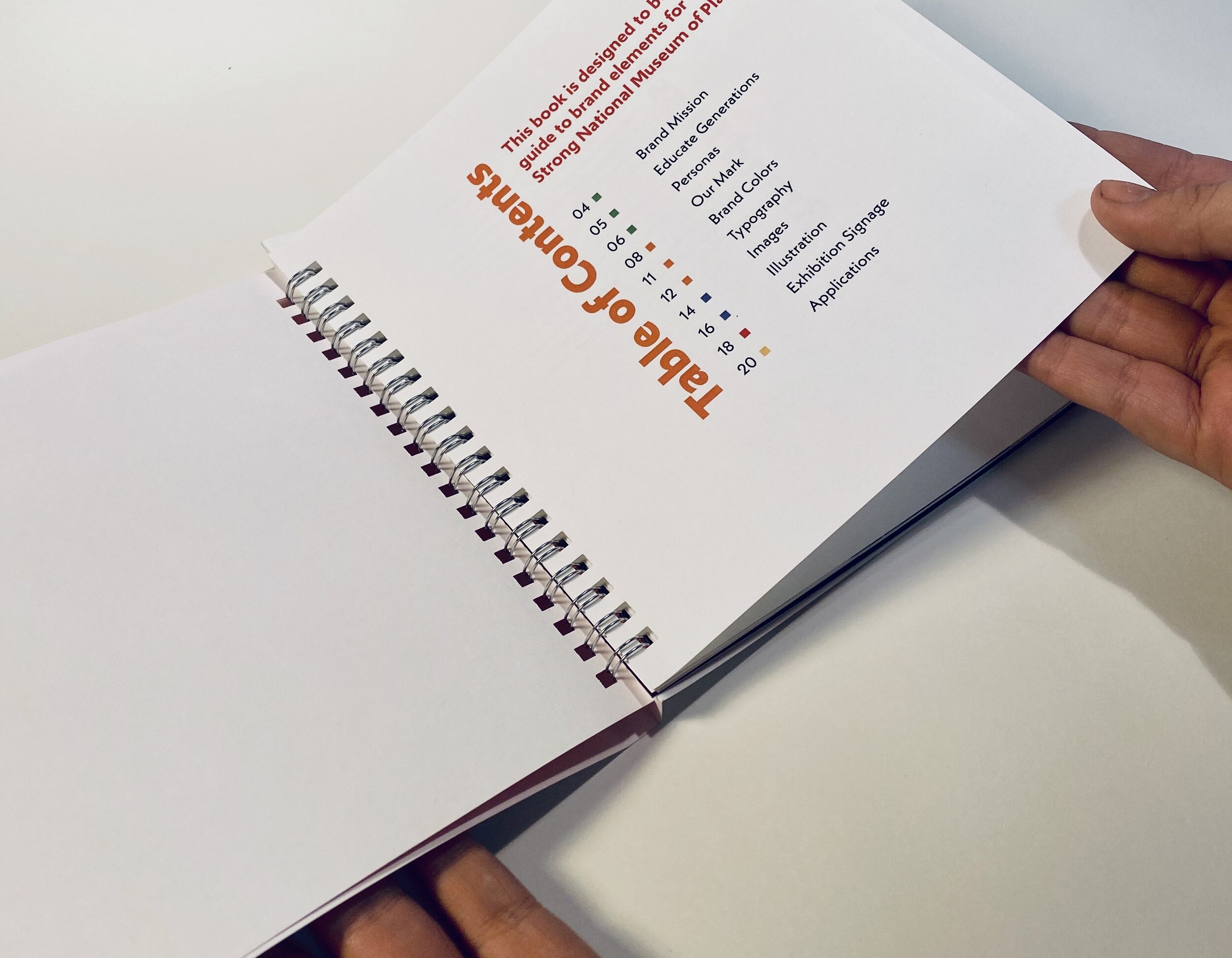
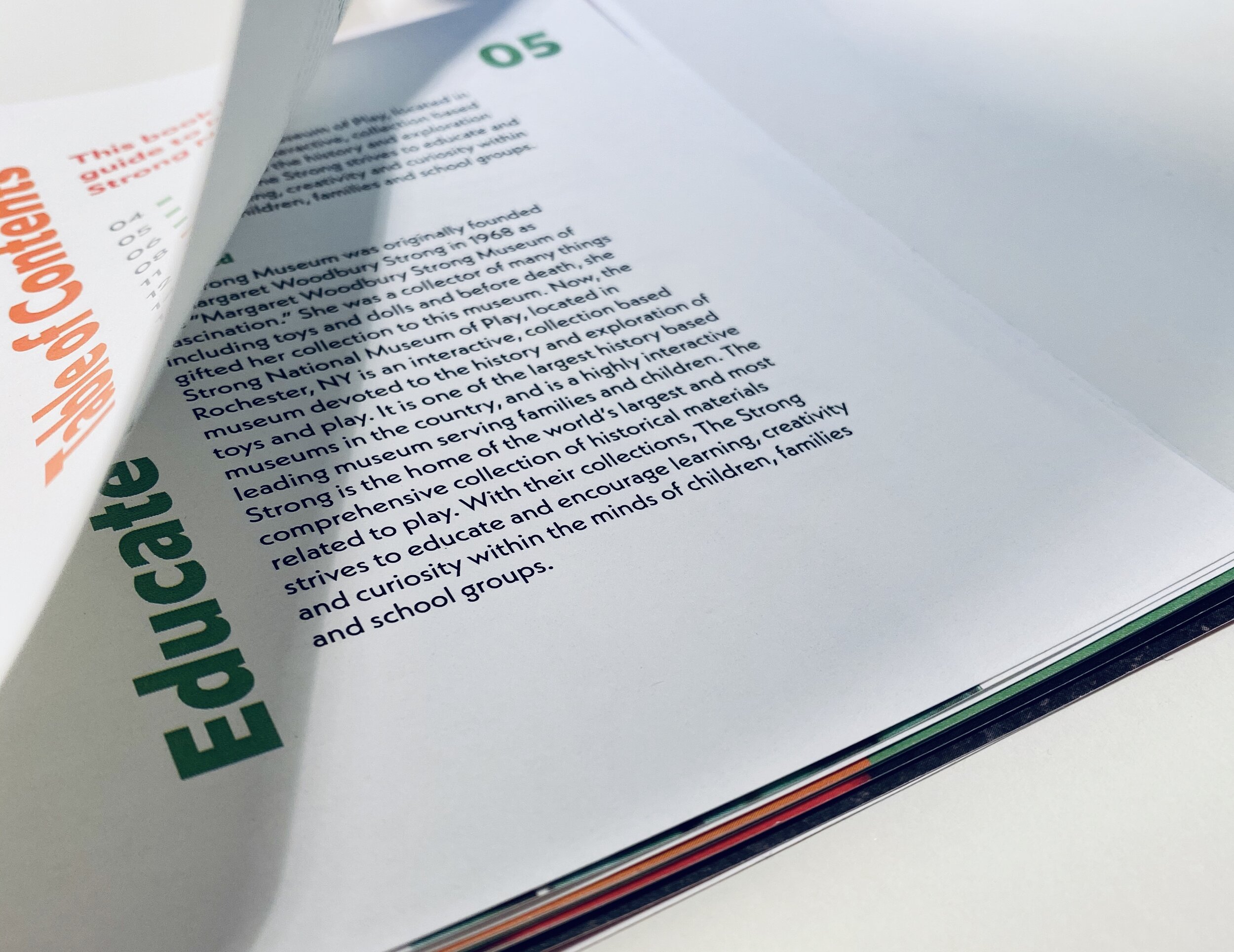
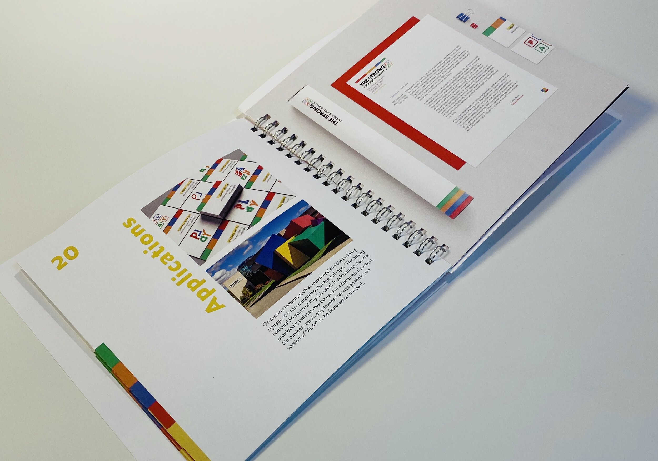
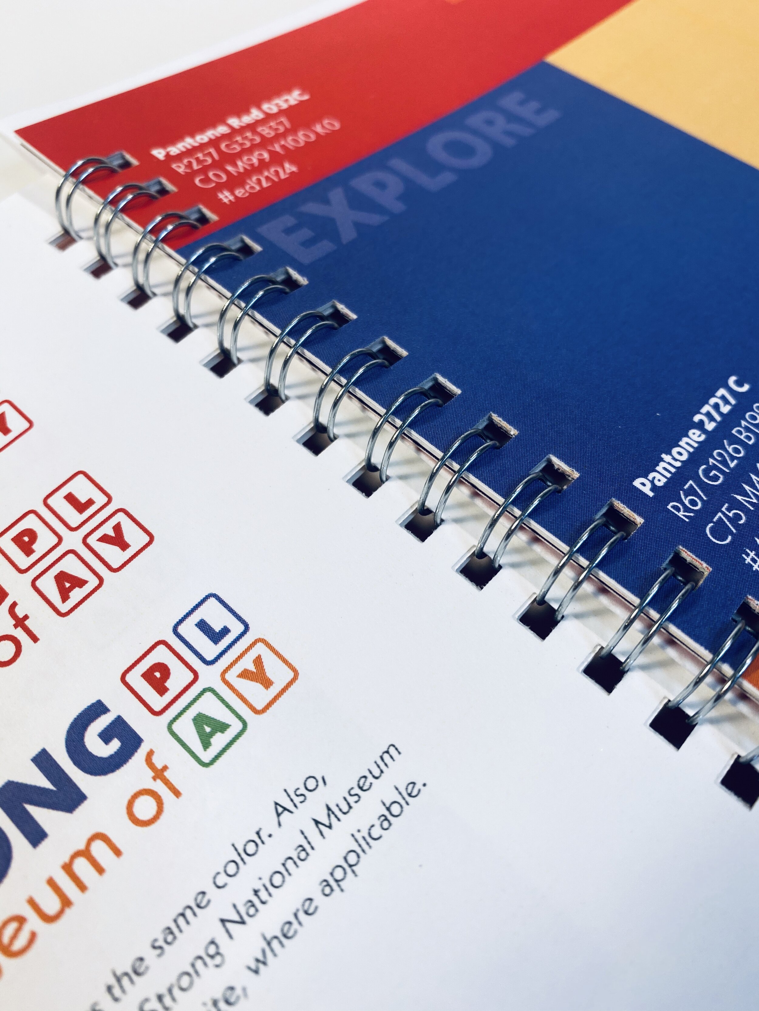
For this project, I set out to rebrand The Strong: National Museum of Play, in order to create a brand identity that appeals to their audience and increases brand recognition. In addition to that, I created a brand guidebook to provide a new set of rules regarding the use of their logo mark, typography, colors, imagery and merchandise.
PROCESS
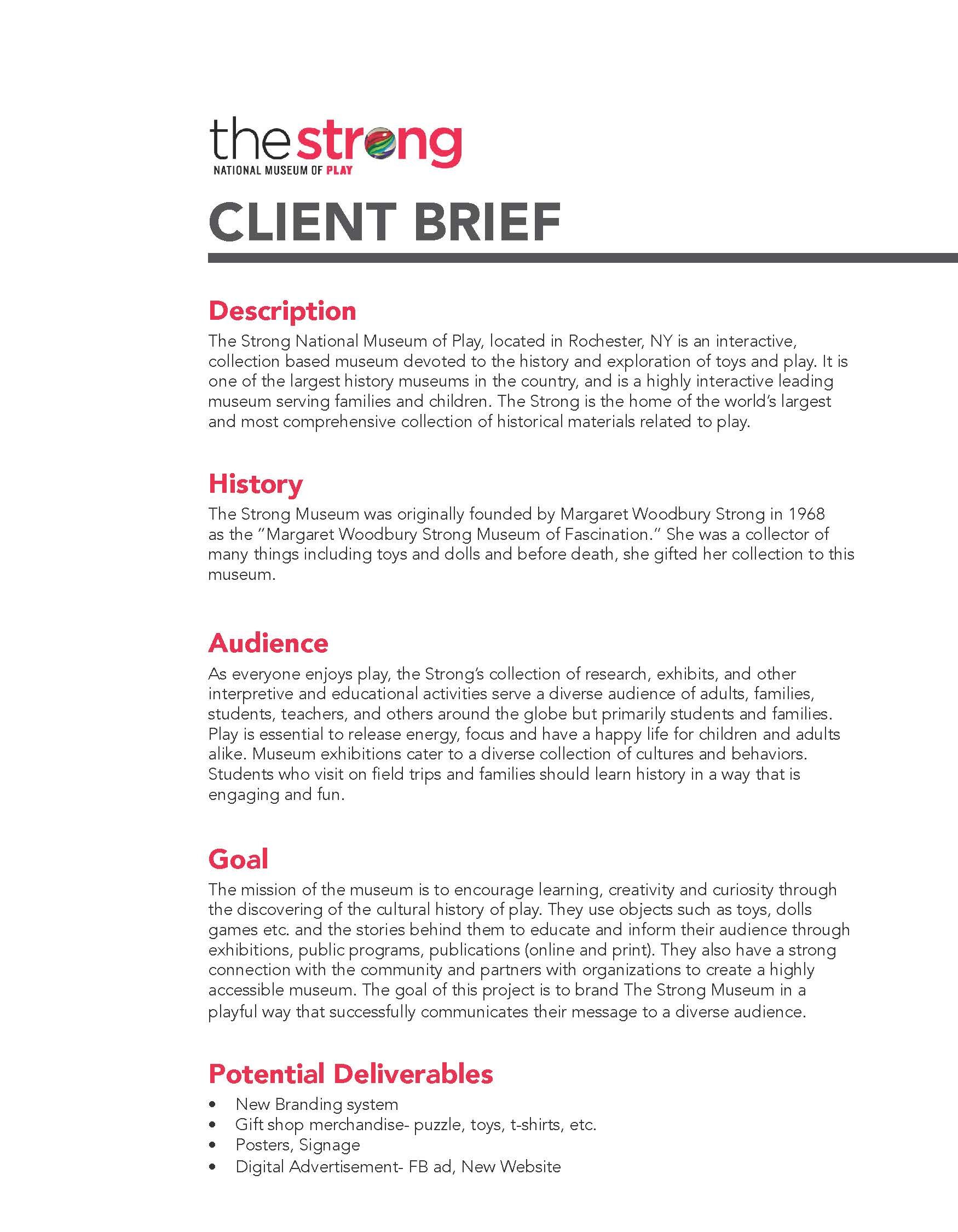
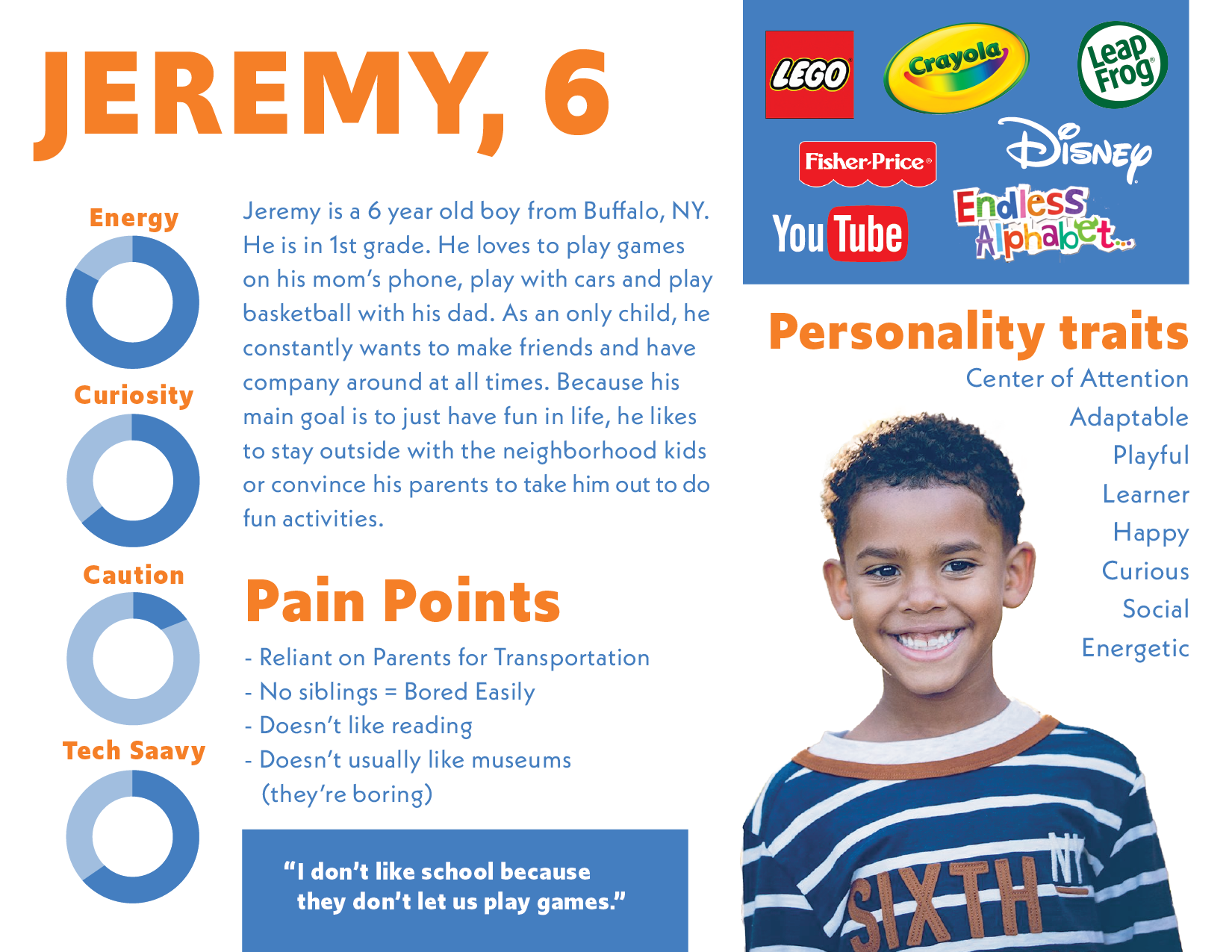
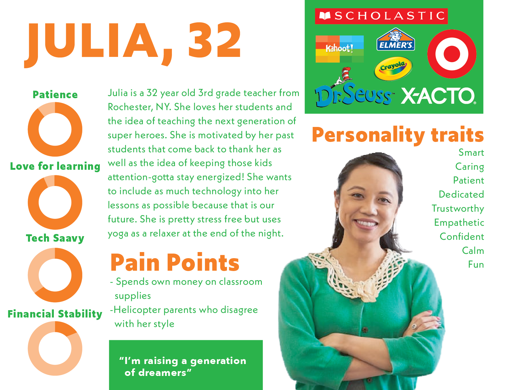
I began by creating a client brief, in the current branding style of the museum and personas based on research about the mission and values of the museum. Julia and Jeremy portray the audience for which I designed the new brand. They represent the values, goals, needs and pain points of The Strong's target audience.
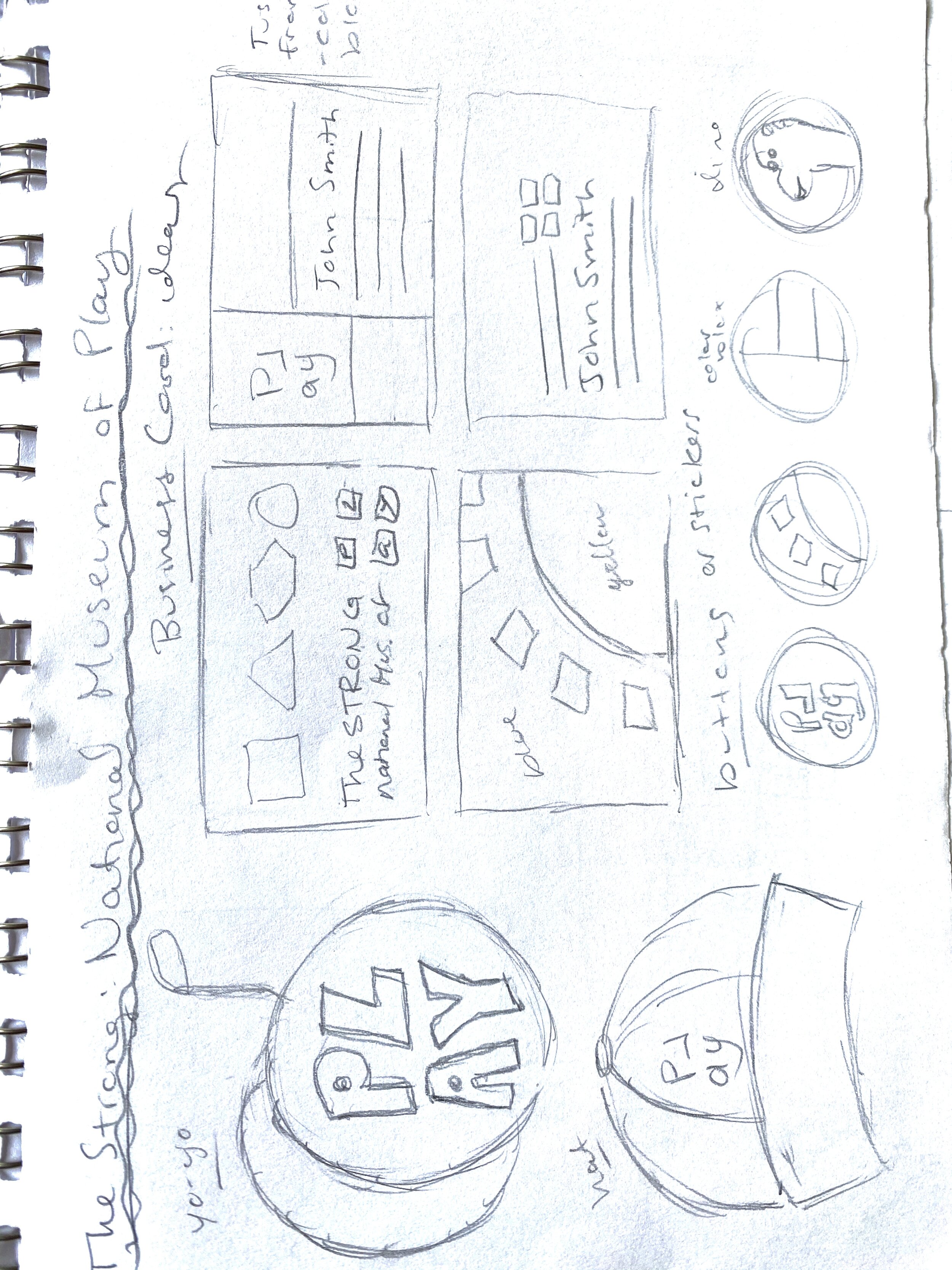
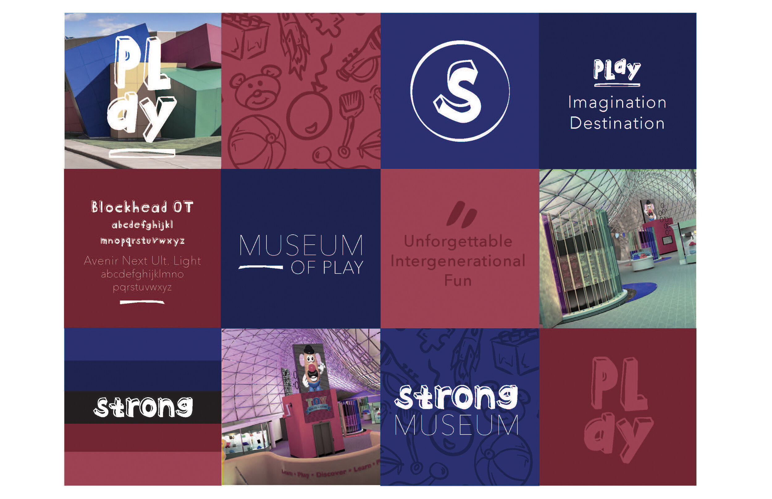
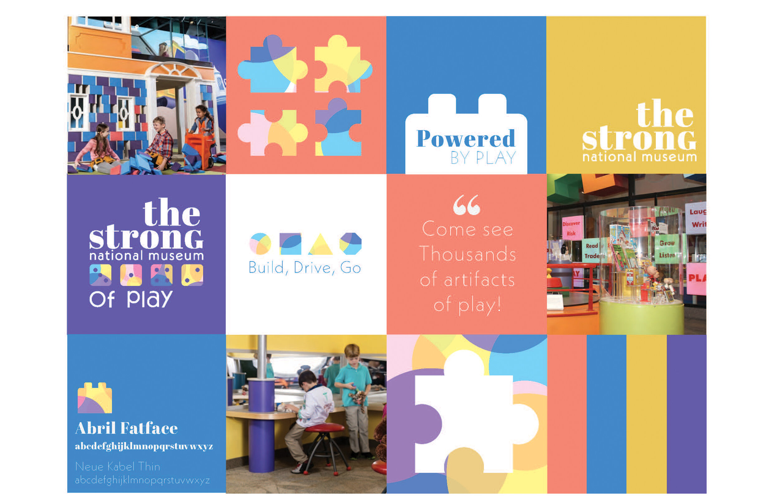
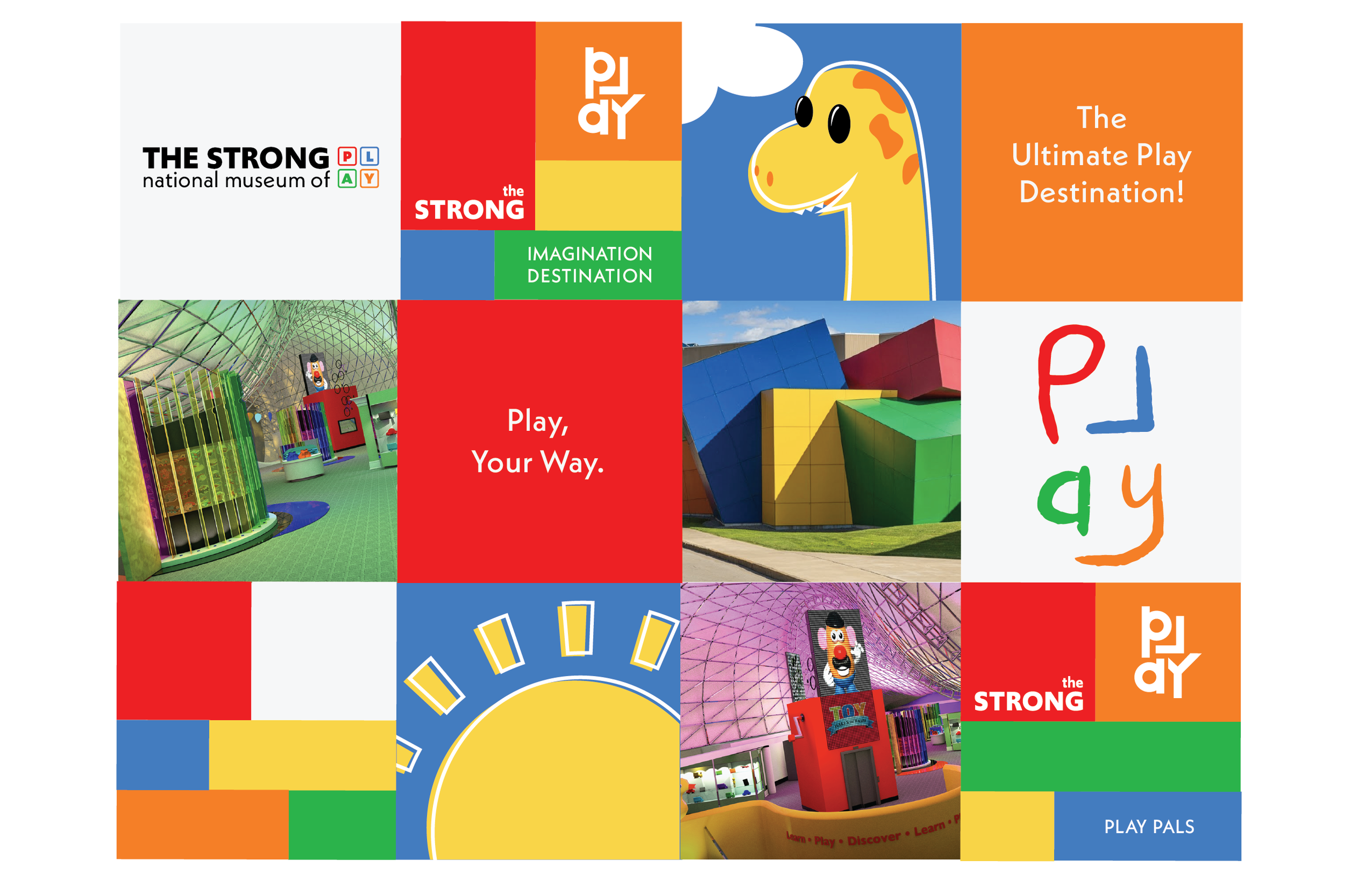
Following ideation and sketching, I created brand squares, to develop 3 different moods, logo ideas and brand styles for the way in which I wanted to market the museum. They all accompanied the needs of their different users: teachers and parents, young children and families. I continued work on the last set of brand squares in order to further develop that idea.

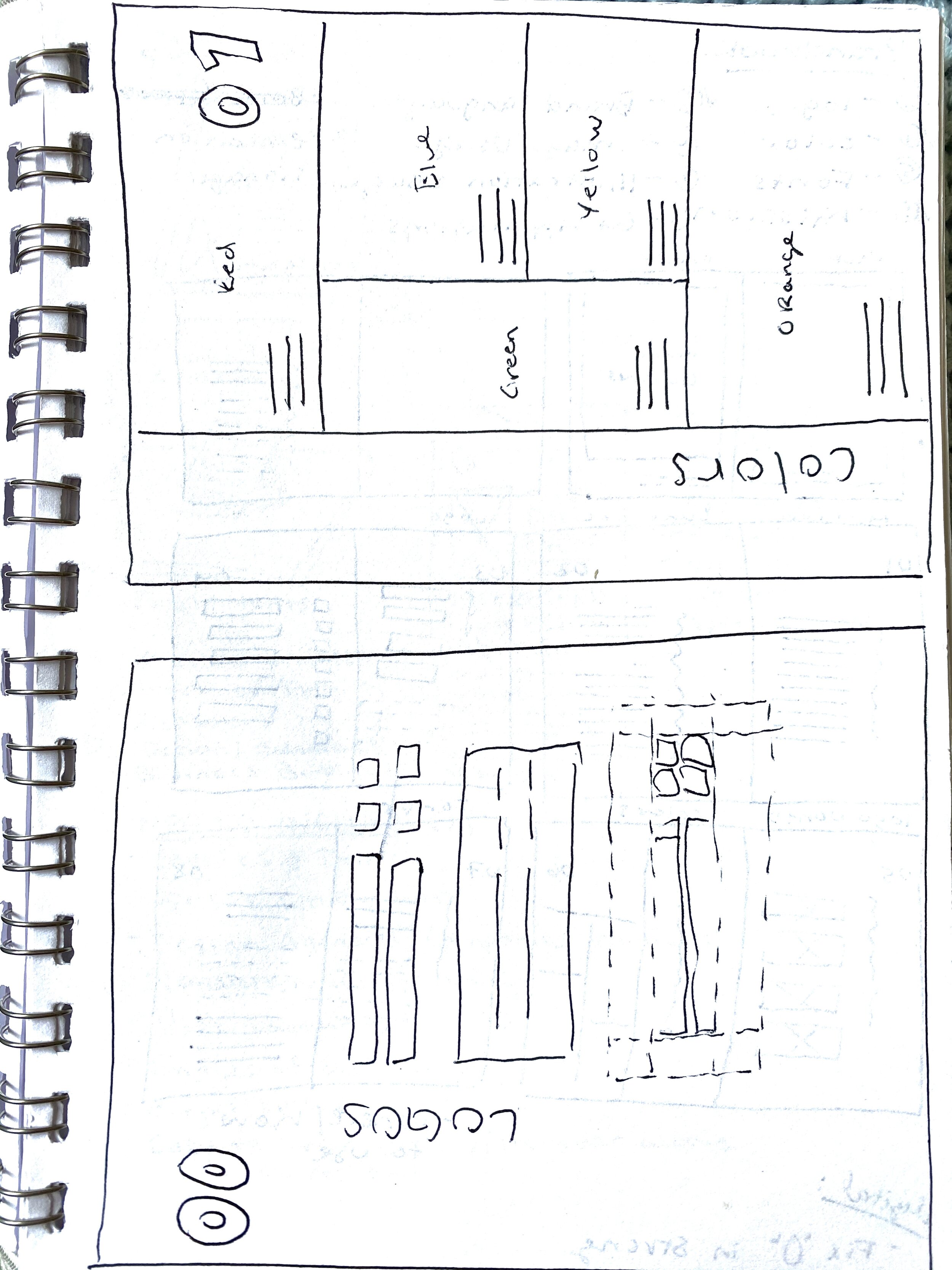
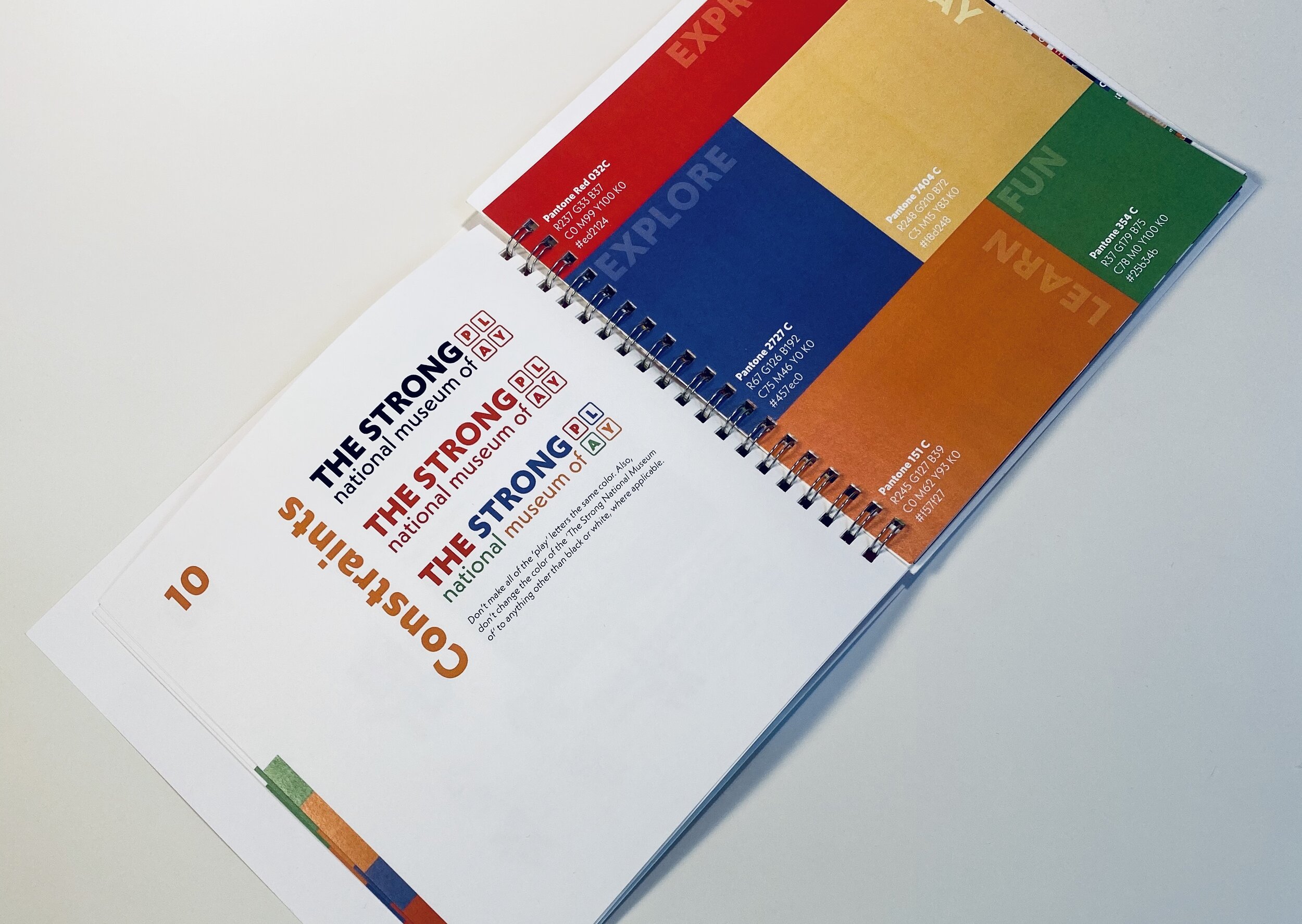
For this brand I created a flexible logo. The letters in “PLAY” are able to be redrawn/designed in any way. The only restriction is that it must follow the brand colors associated with each letter and be set in this square lockup.


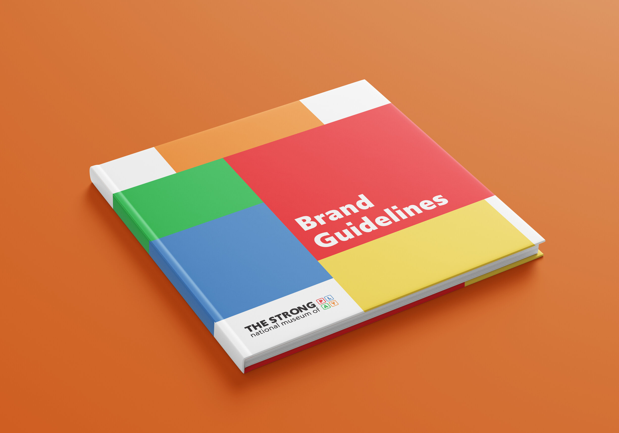
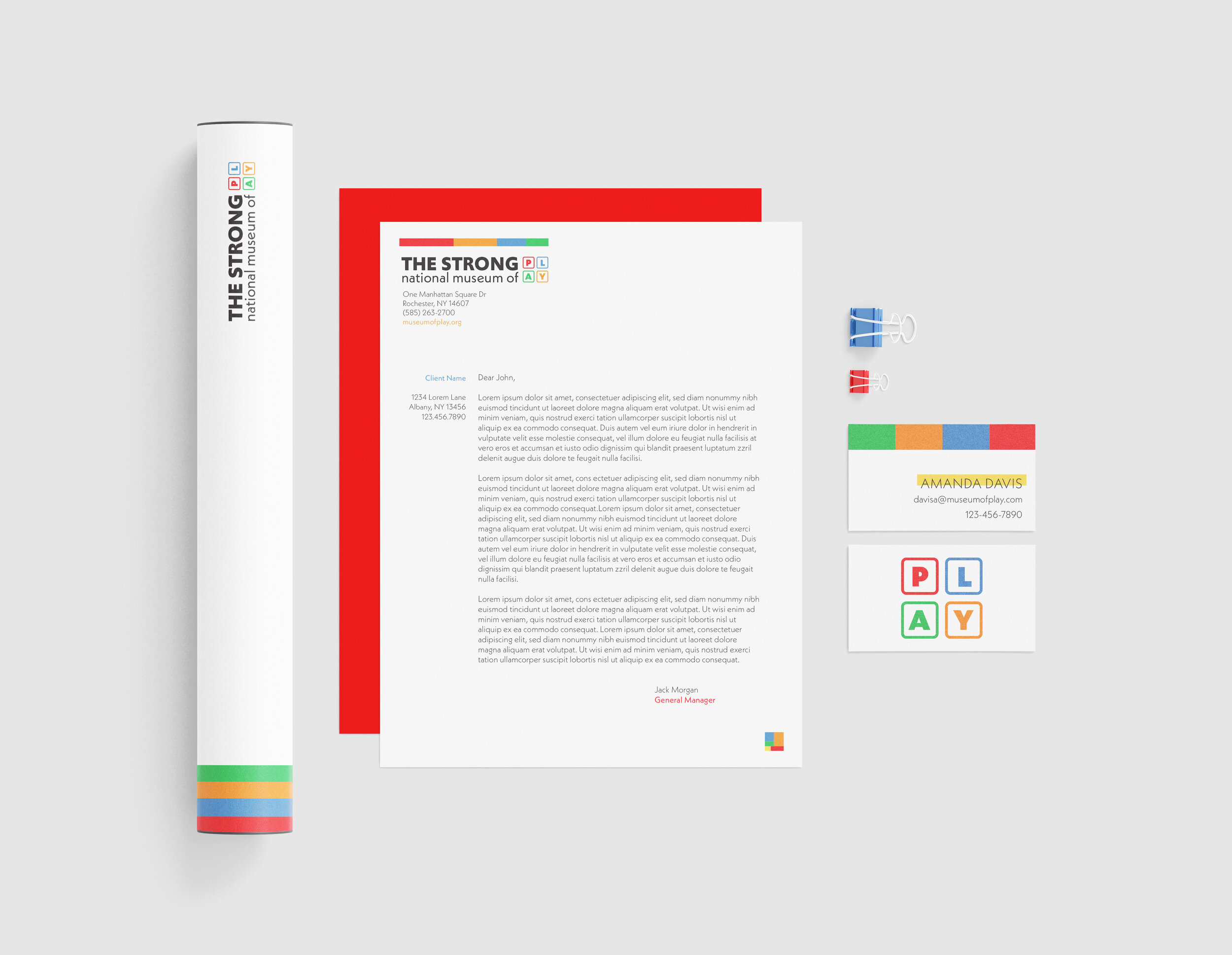
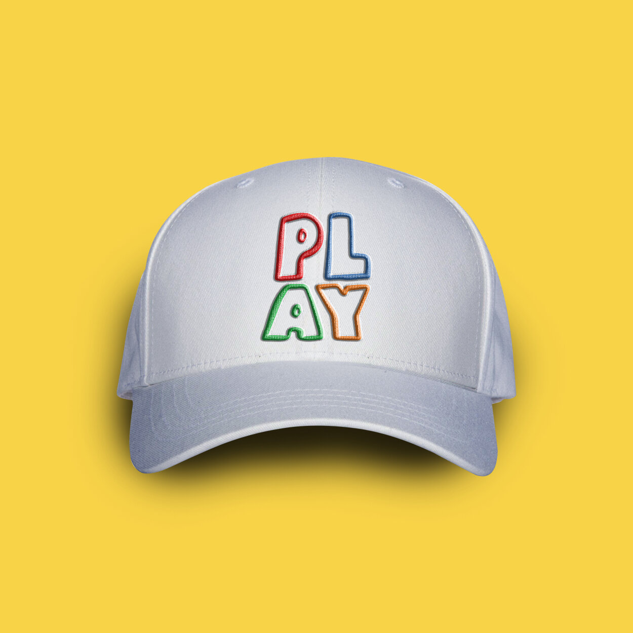
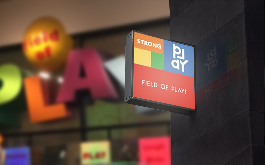
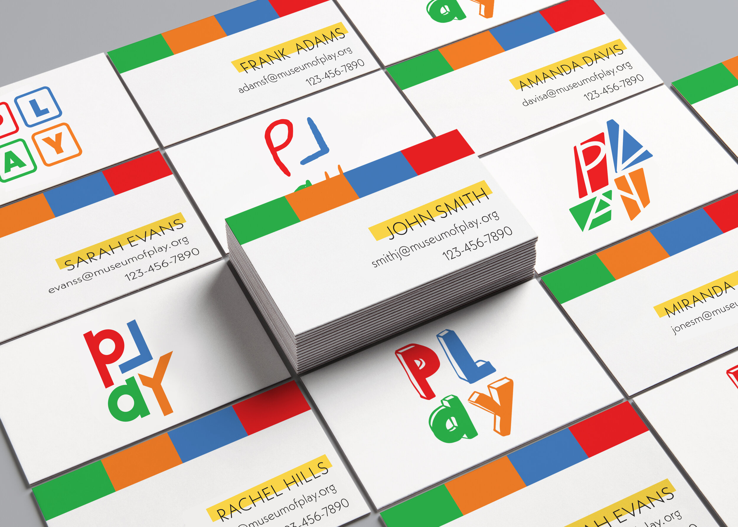
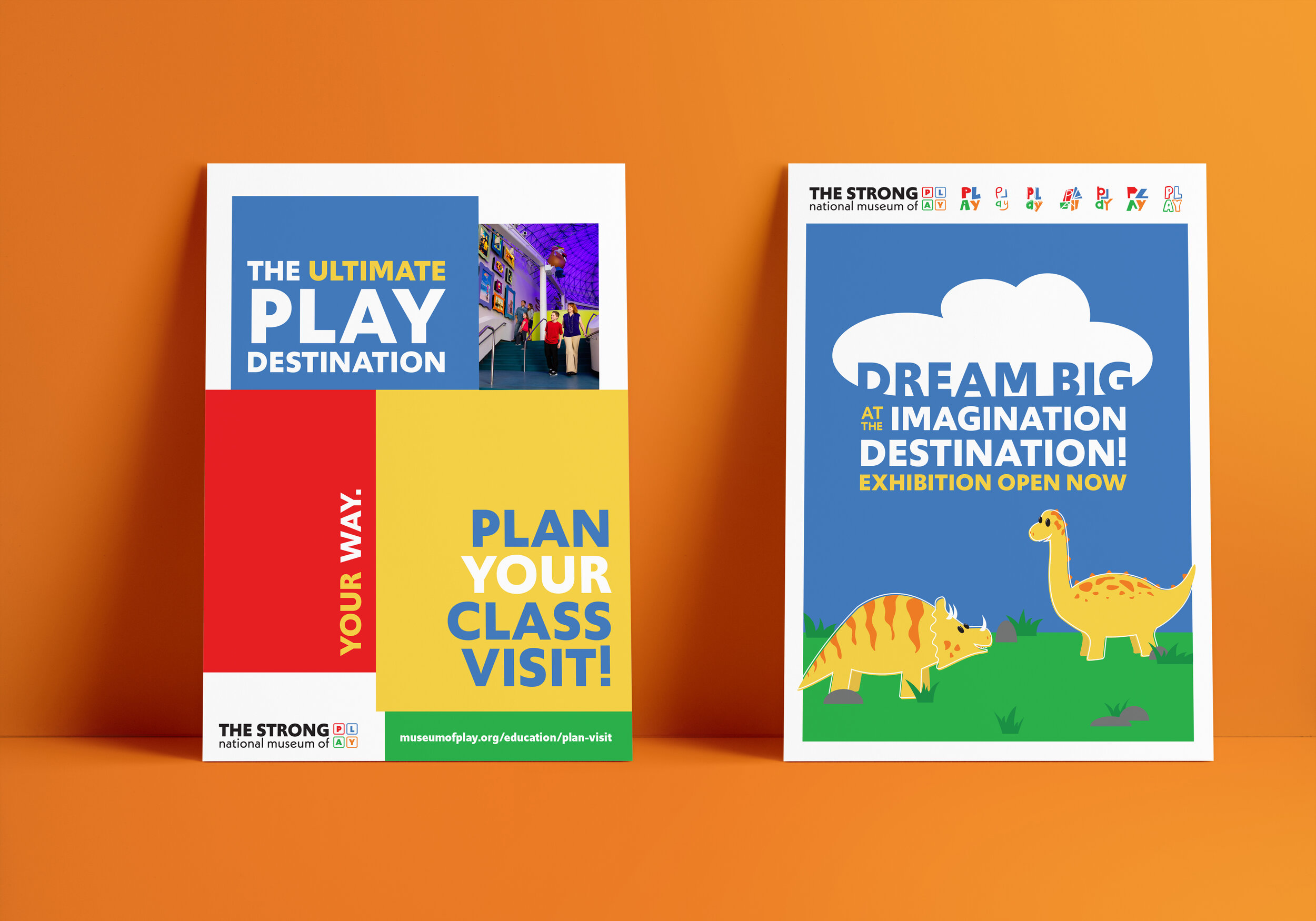
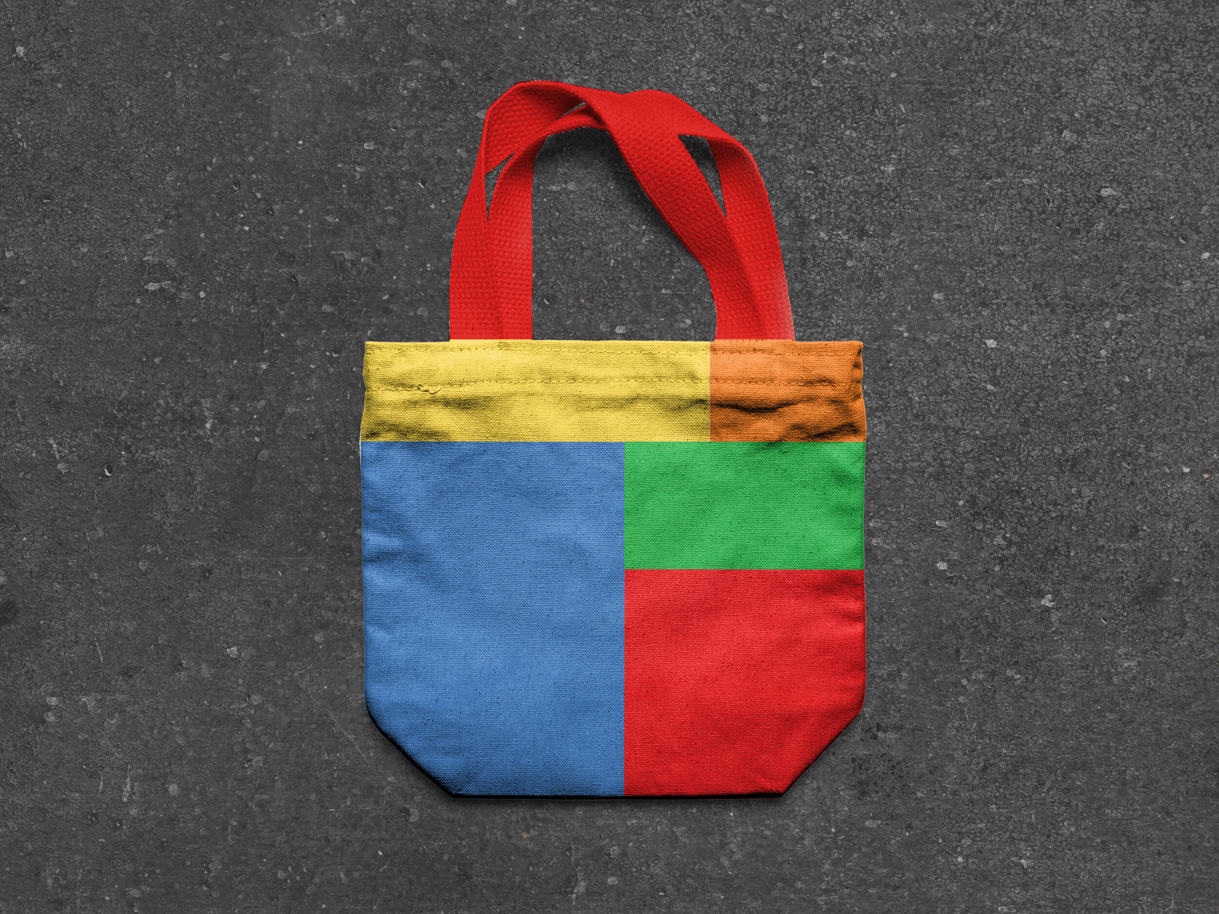
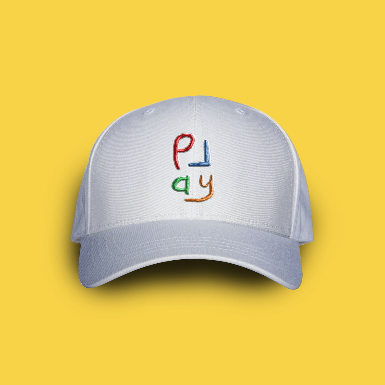
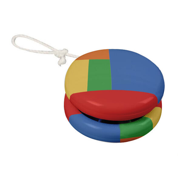
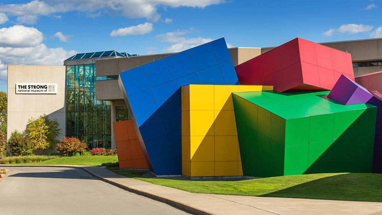
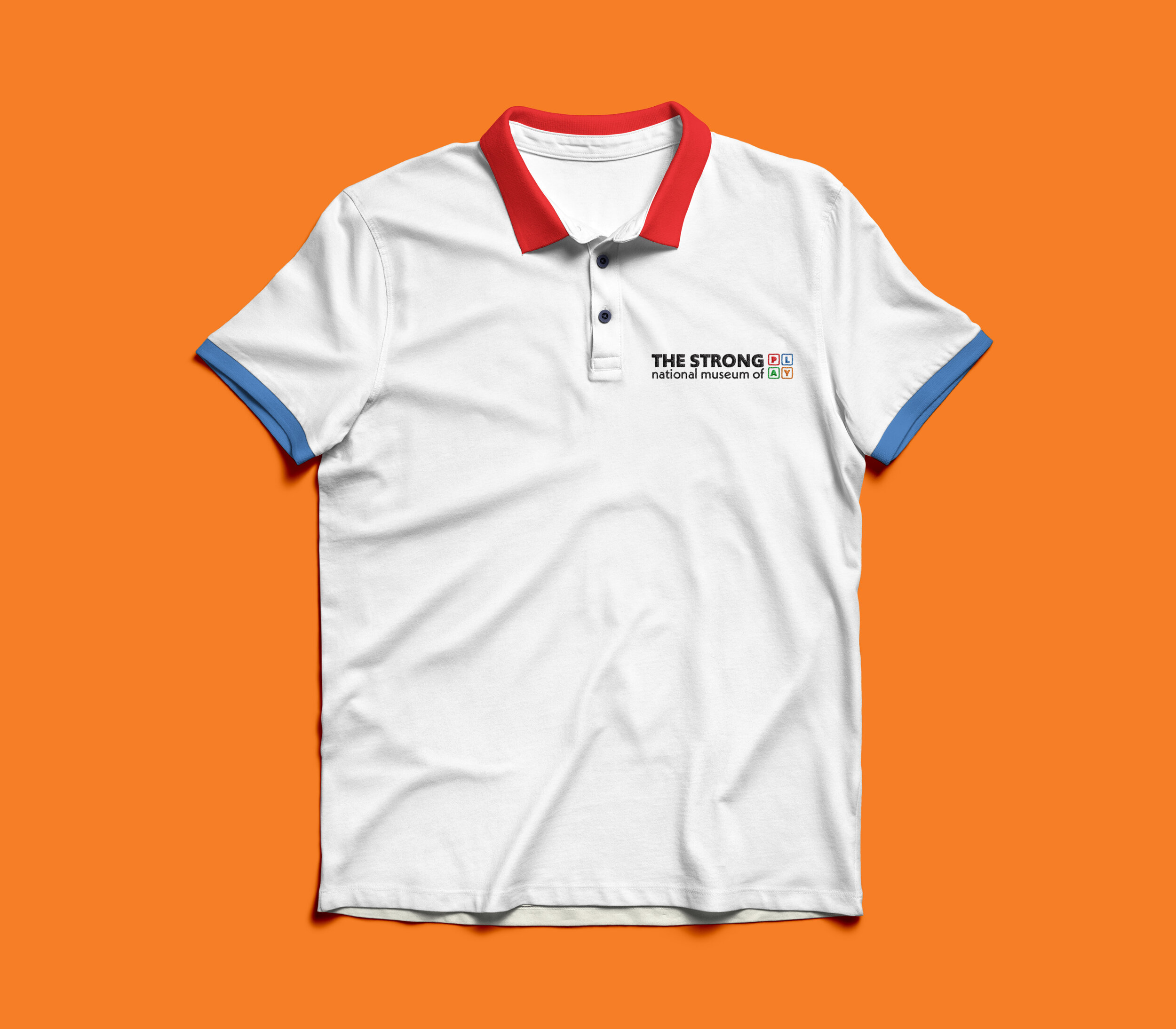
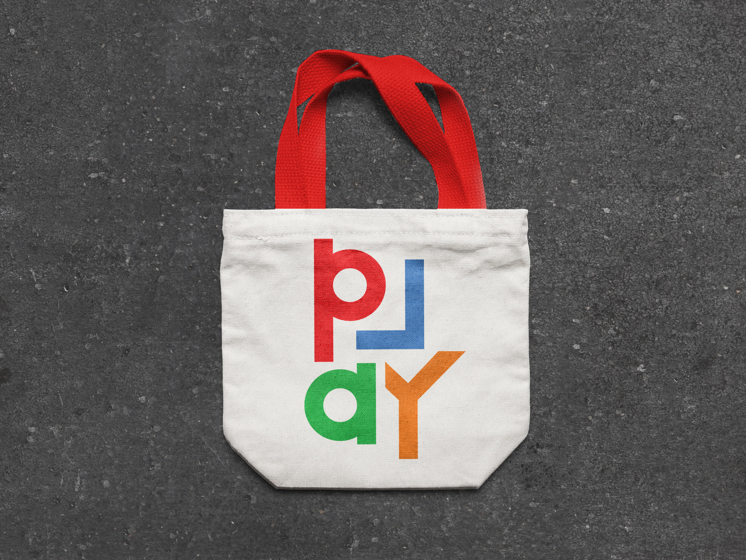
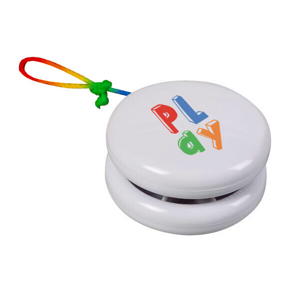


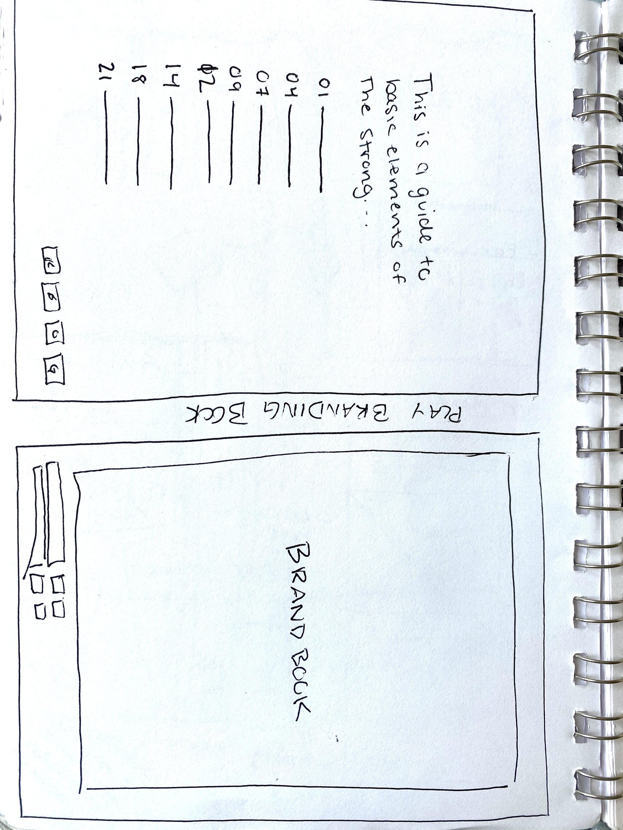
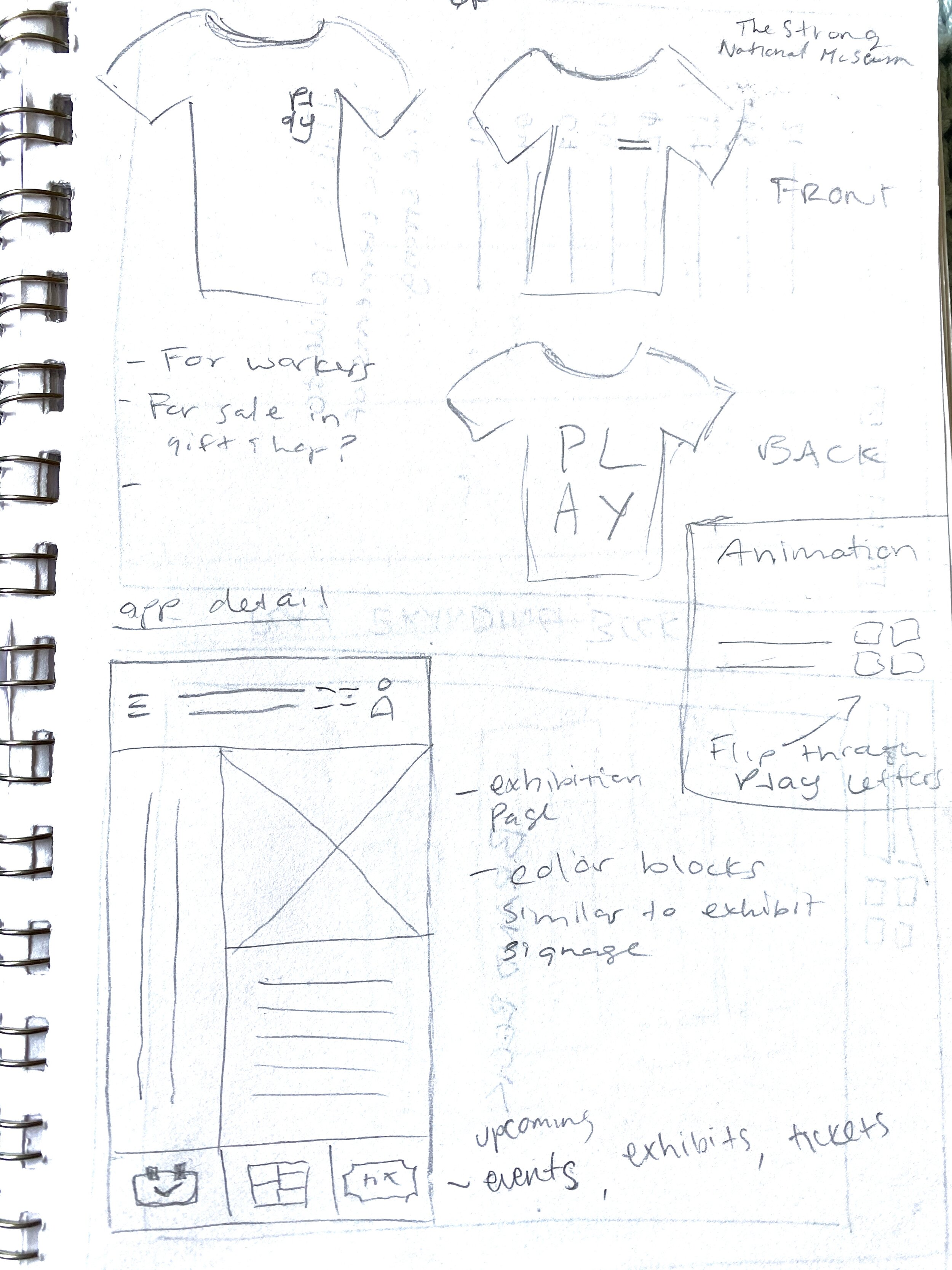
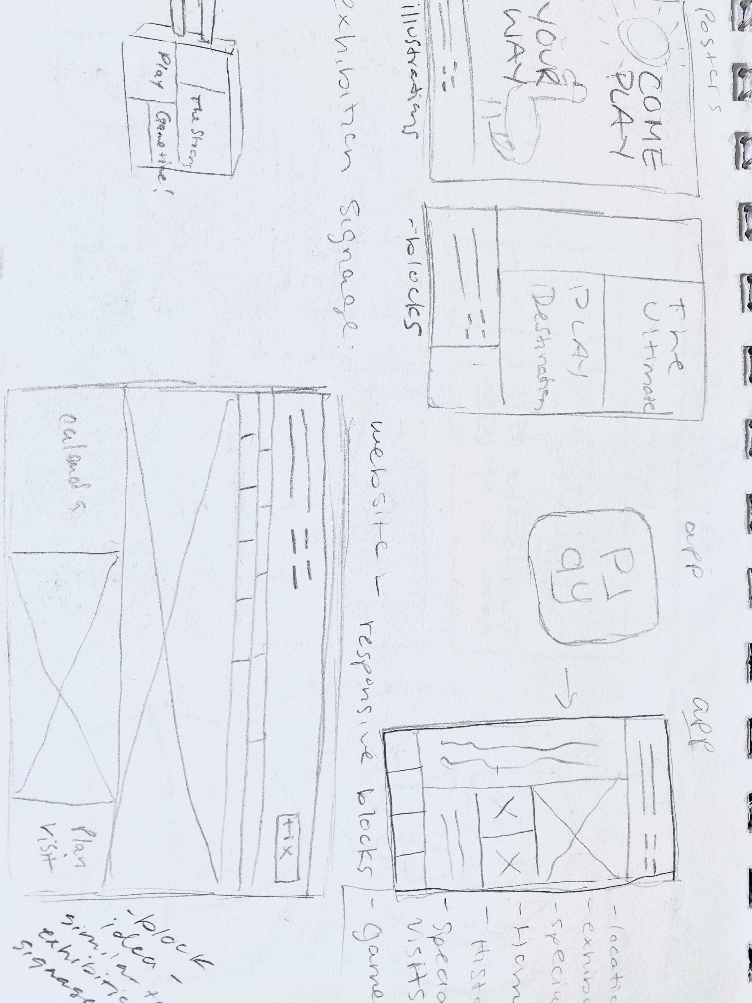
From there, I completed the cohesive set of elements included in this rebrand. I implemented these ideas through a variety of physical and digital applications including a new website and app homepage, apparel, posters, gift shop merchandise and a logo animation.
When creating the signage to signify different exhibitions displayed within the museum, I developed a square, light up sign that is flexible in colors and shape lock ups depending on the exhibition.


