Switzerland Tourism

SWitzerland
Tourism package
CLIENT
Switzerland Tourism Bureau
DESIGN TYPE
Branding, Packaging, Interface, Environmental
ROLE
Designer, Research
AUDIENCE
Young Adults interested in traveling abroad
SUMMARY
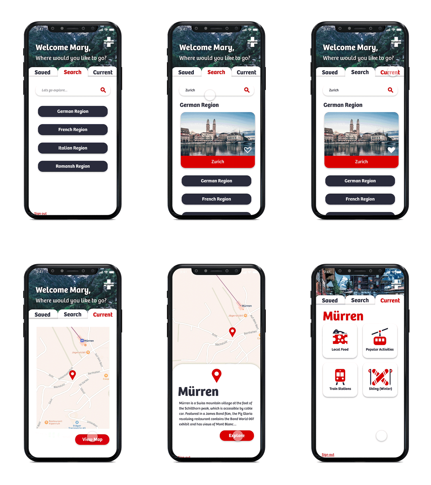
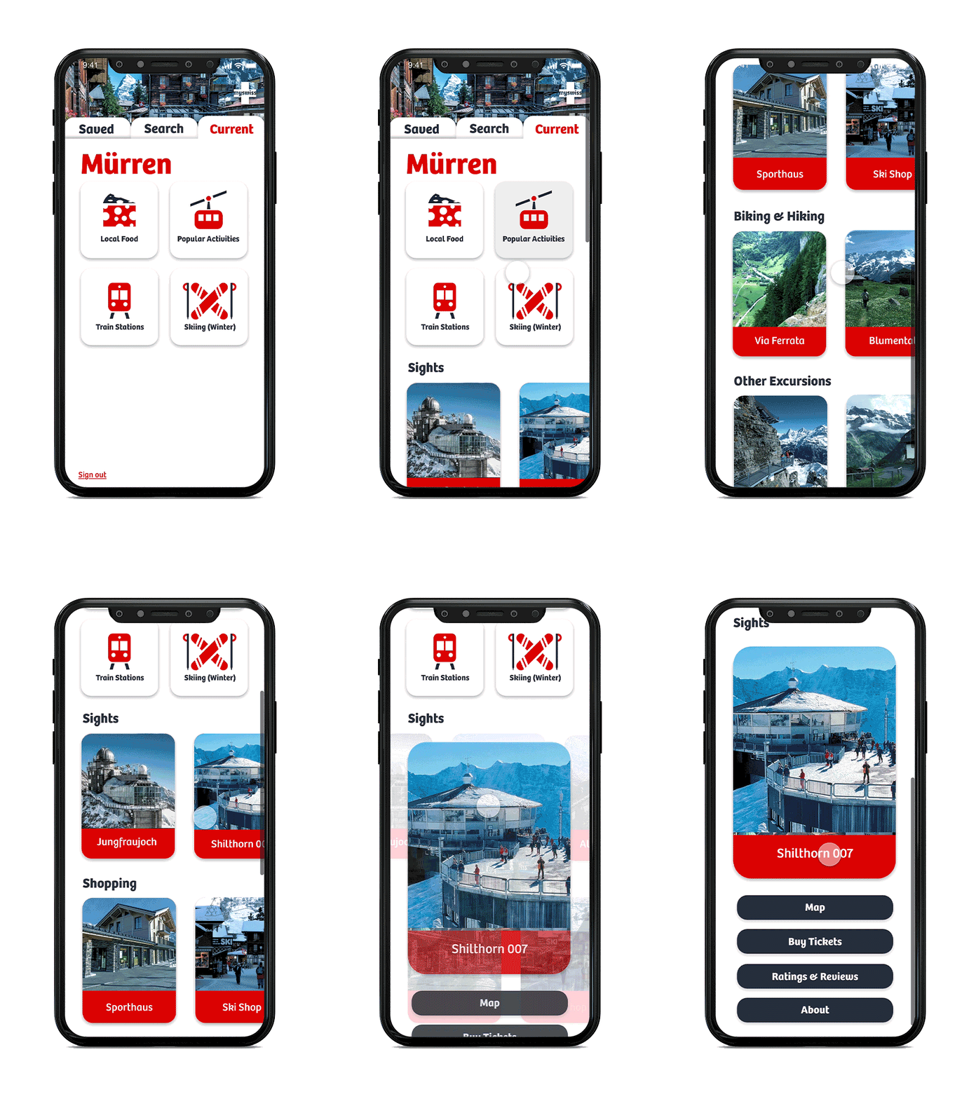
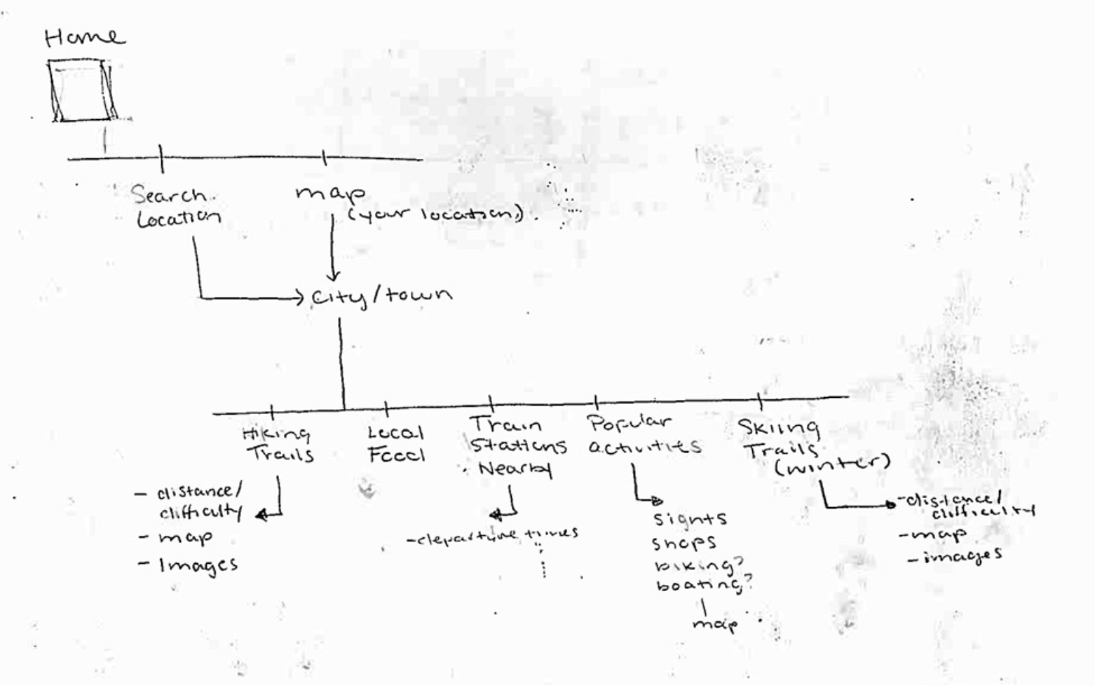
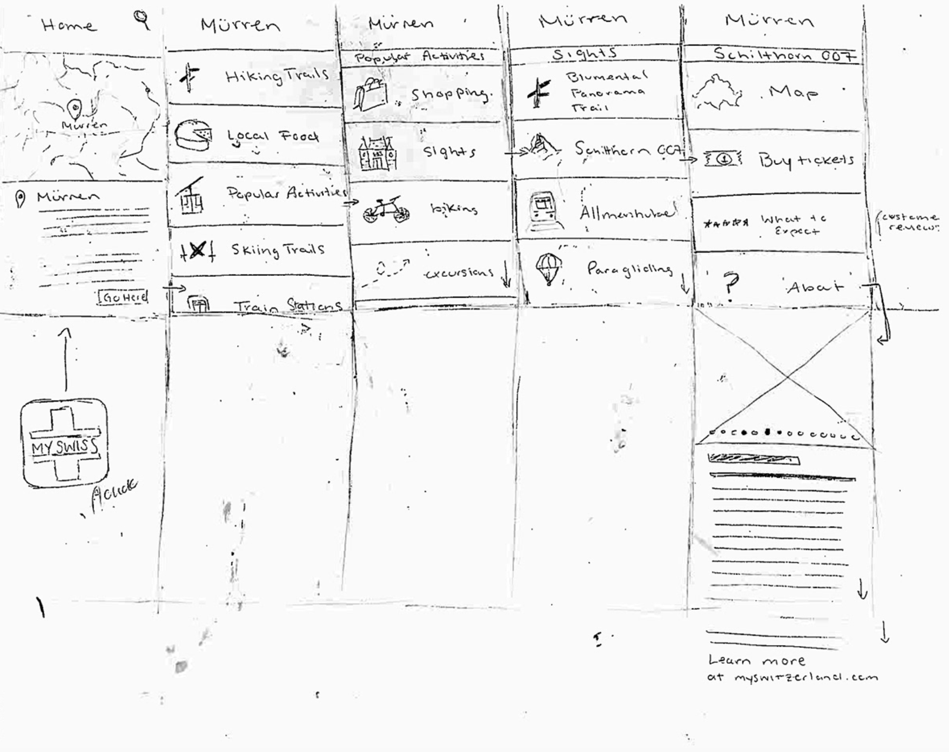
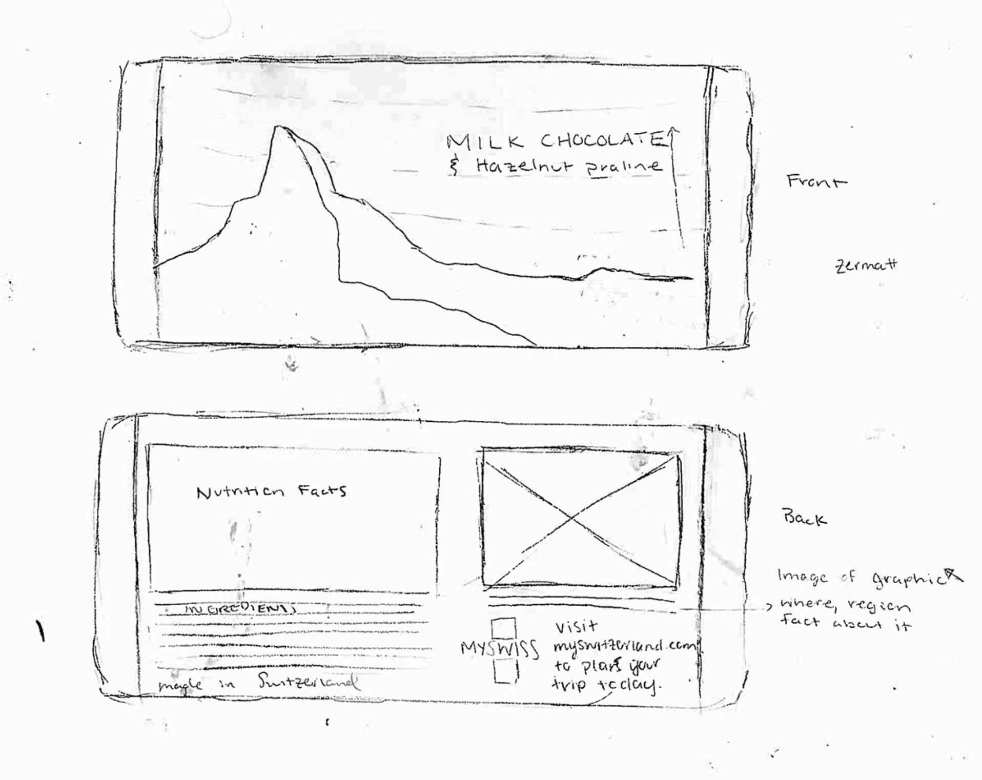
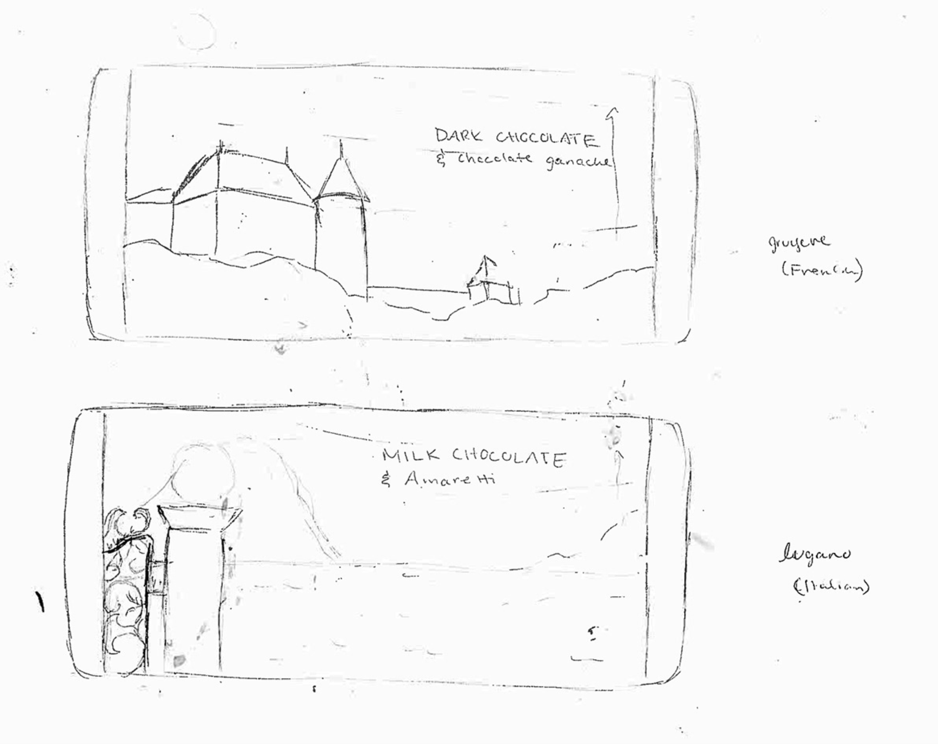
I wanted this particular project to be about something I am very passionate about, traveling. I designed this system of two posters and collateral to encourage young travelers to visit Switzerland. Each poster in the series solves a different problem, the first being that people are unaware of the cultural and language diversity within the country. The second poster is a visual perspective on the opportunities and activities that go along with taking a trip there. These posters would be placed in popular areas that travelers may visit, such as airports, train stations and community centers. To round out the poster series, I created an app interface that would be used while traveling, packages for chocolate bars and a display to put in stores, as well as advertisements for print and social uses.
PROCESS
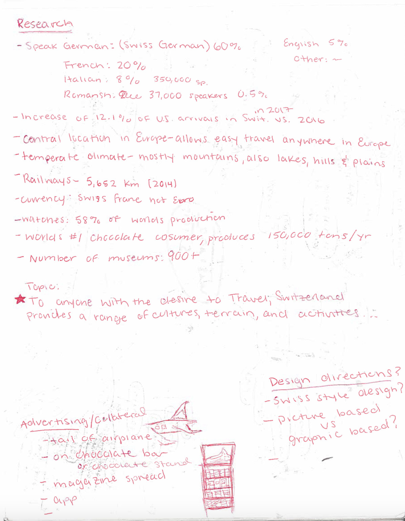
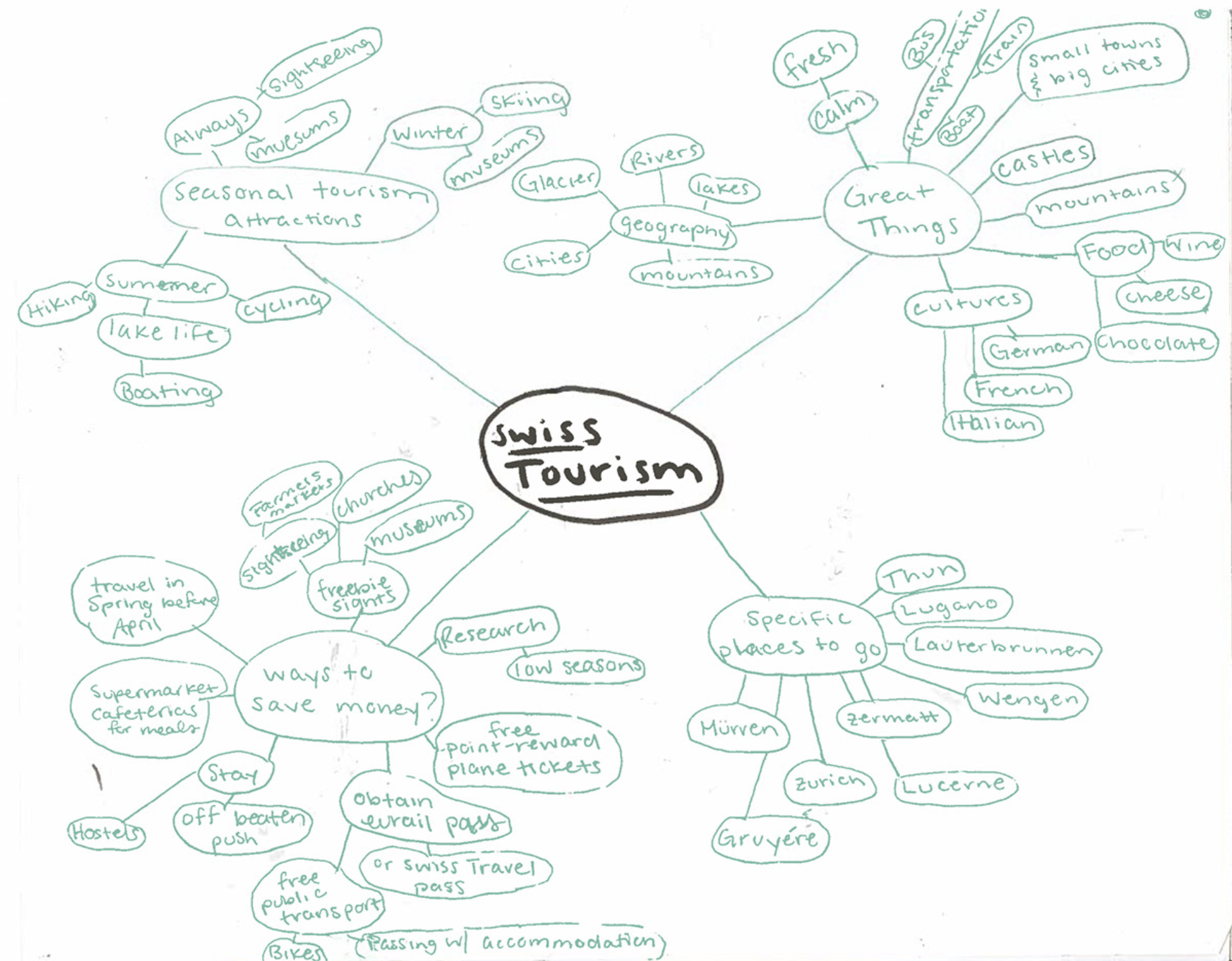
I started with research into misconceptions about Switzerland and important facts regarding swiss tourism and culture .
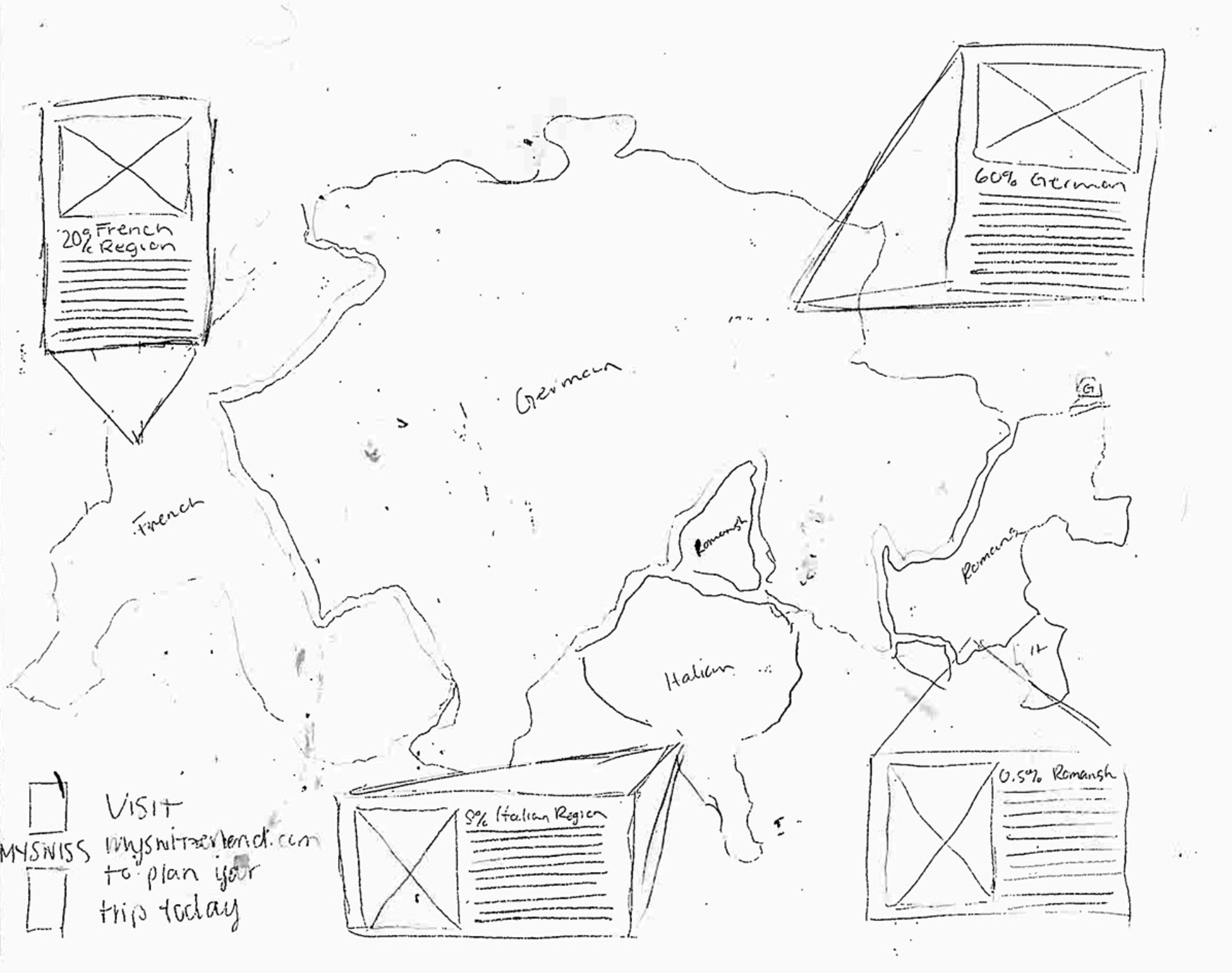
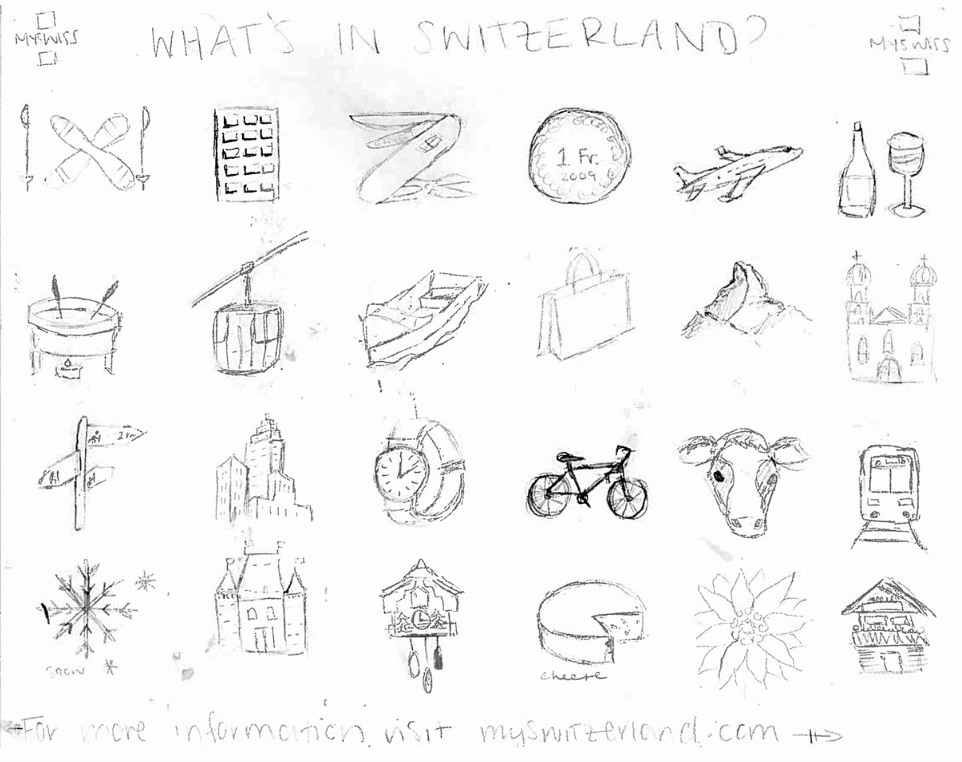
Following research, I developed sketches for multiple iterations of poster and other collateral designs.


The poster icons and design style helped me develop the packaging design for the chocolate bars and display to sell them in stores.


When moving to advertisements and digital media, I implemented more photography, mixed with the graphic color block style of the posters to create the app interface and social advertisements.


