Kool-Aid Jammers

Koolaid jammers
A rebrand
CLIENT
Kool-Aid
DESIGN TYPE
Branding, Packaging
ROLE
Designer, Research
aUDIENCE
Millennials who care about the environment and their health
SUMMARY
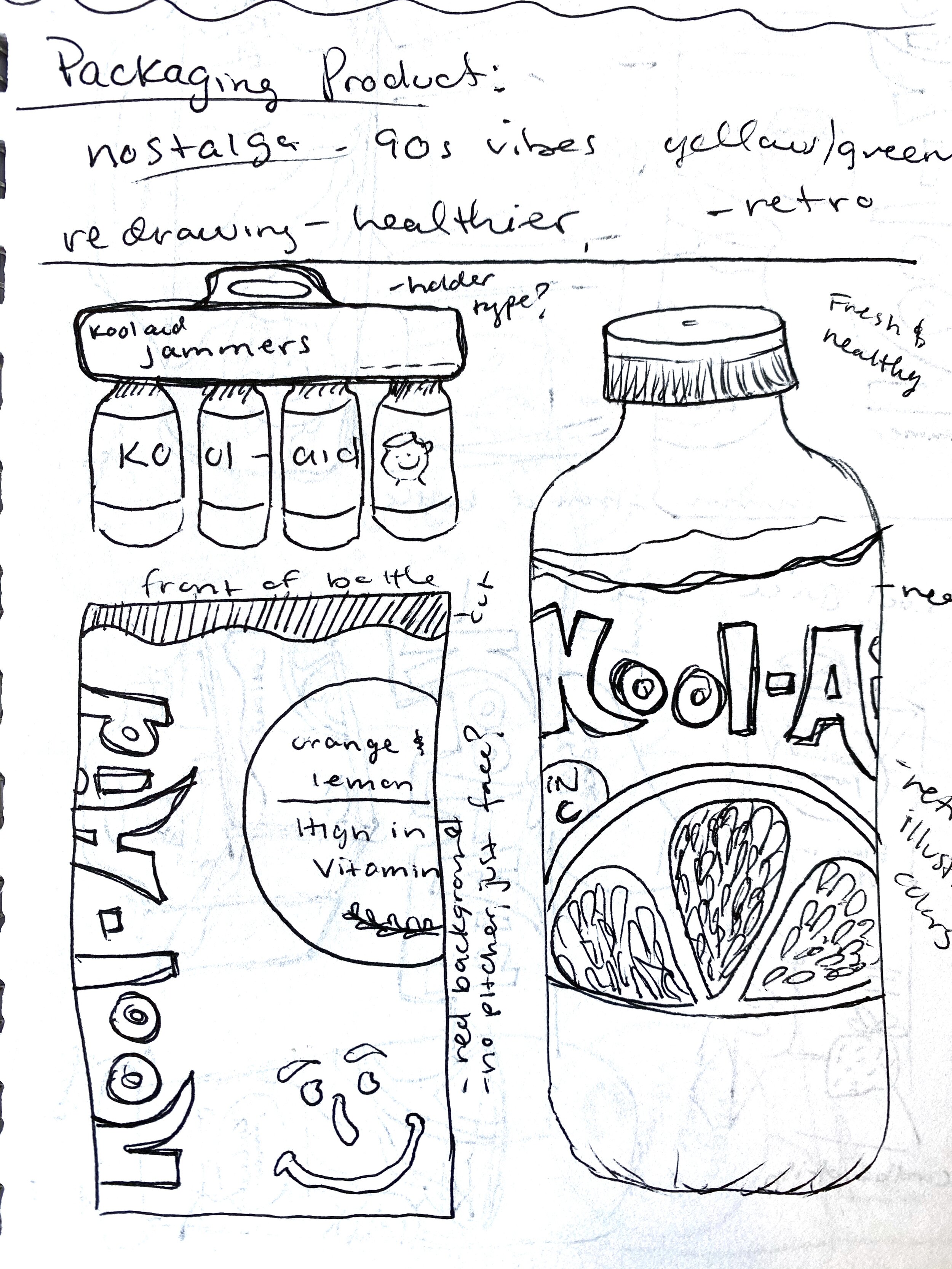
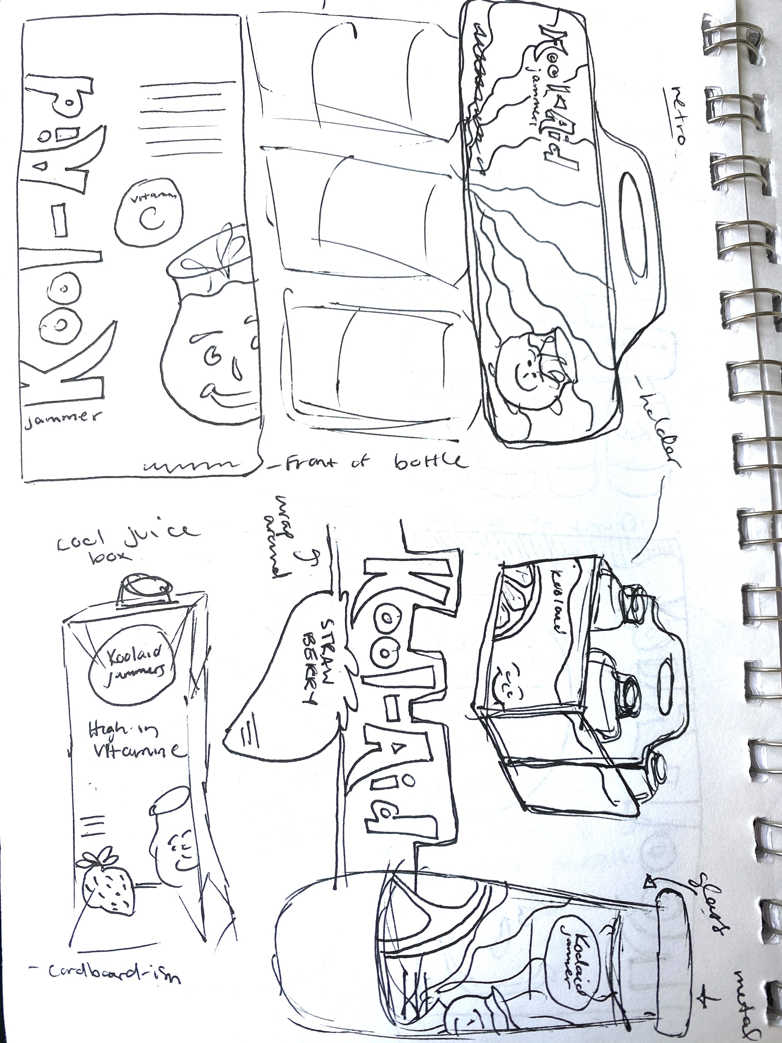
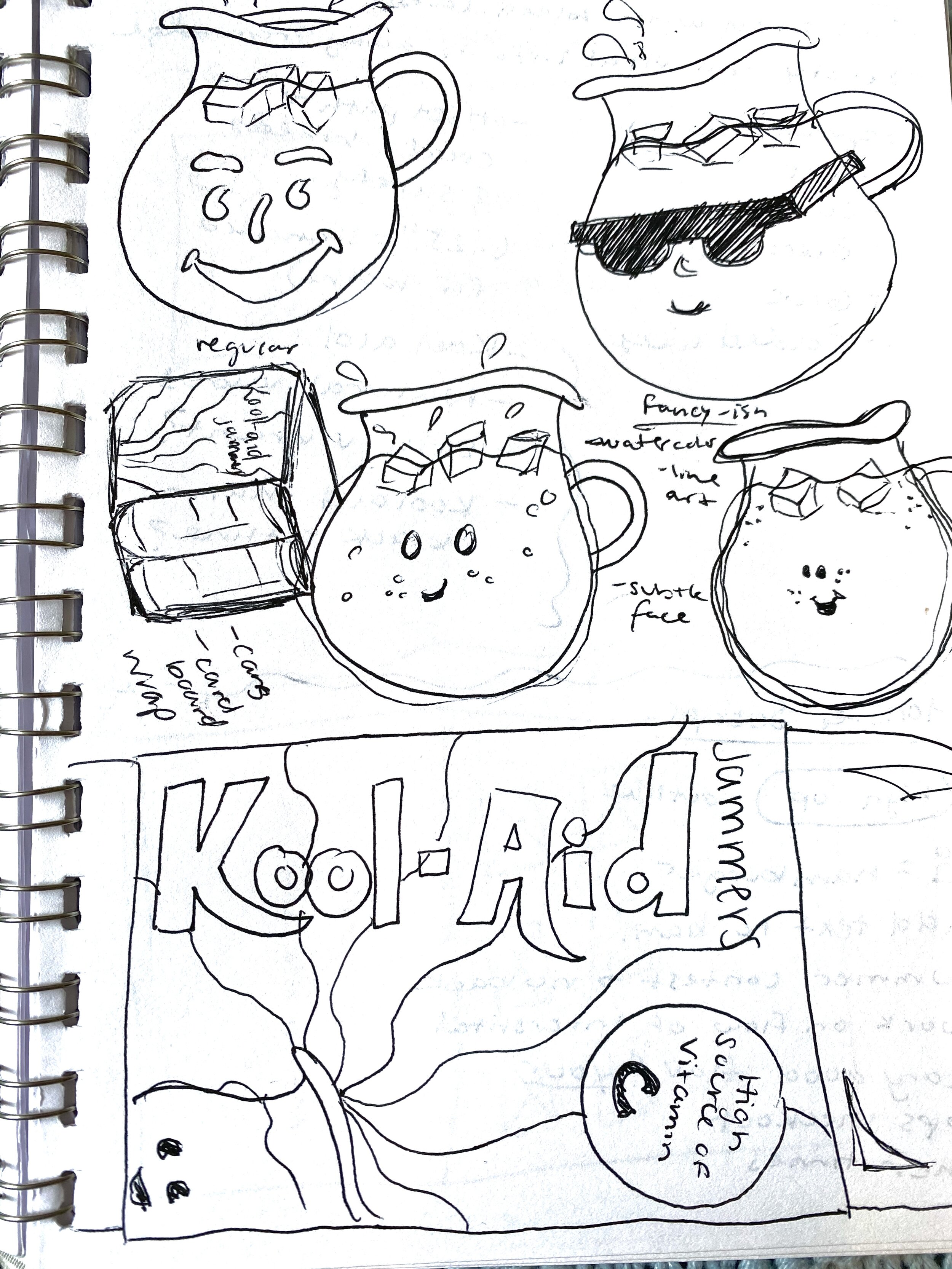
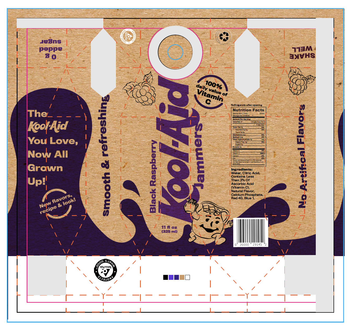
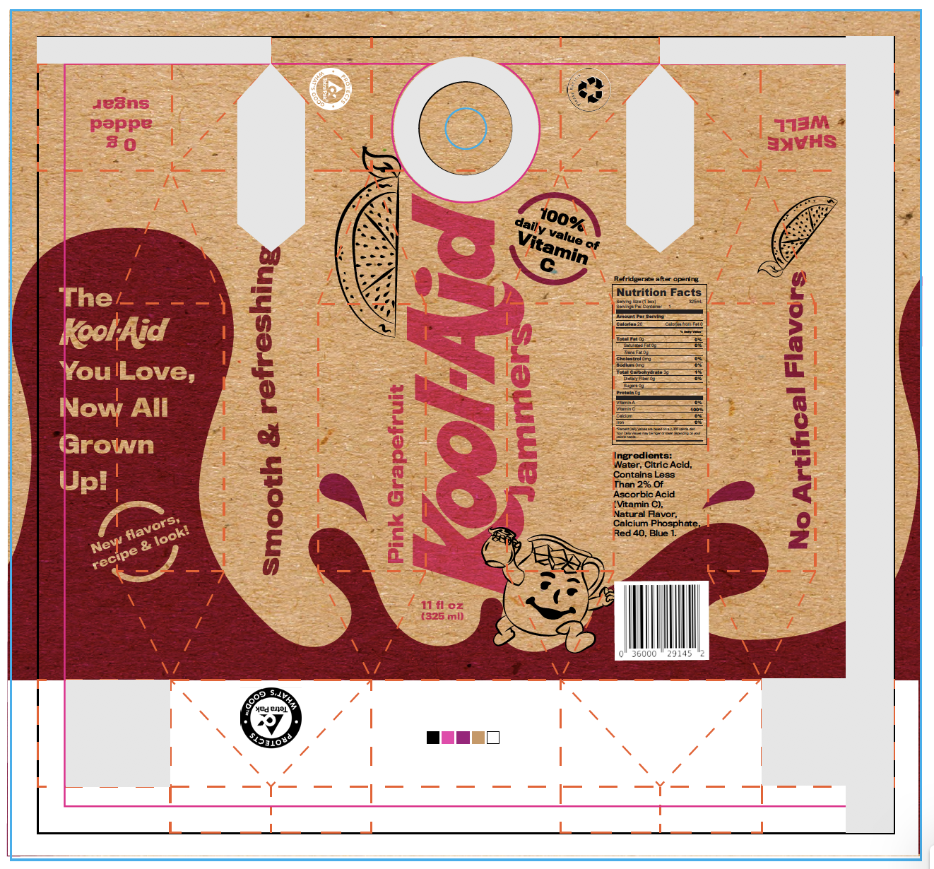
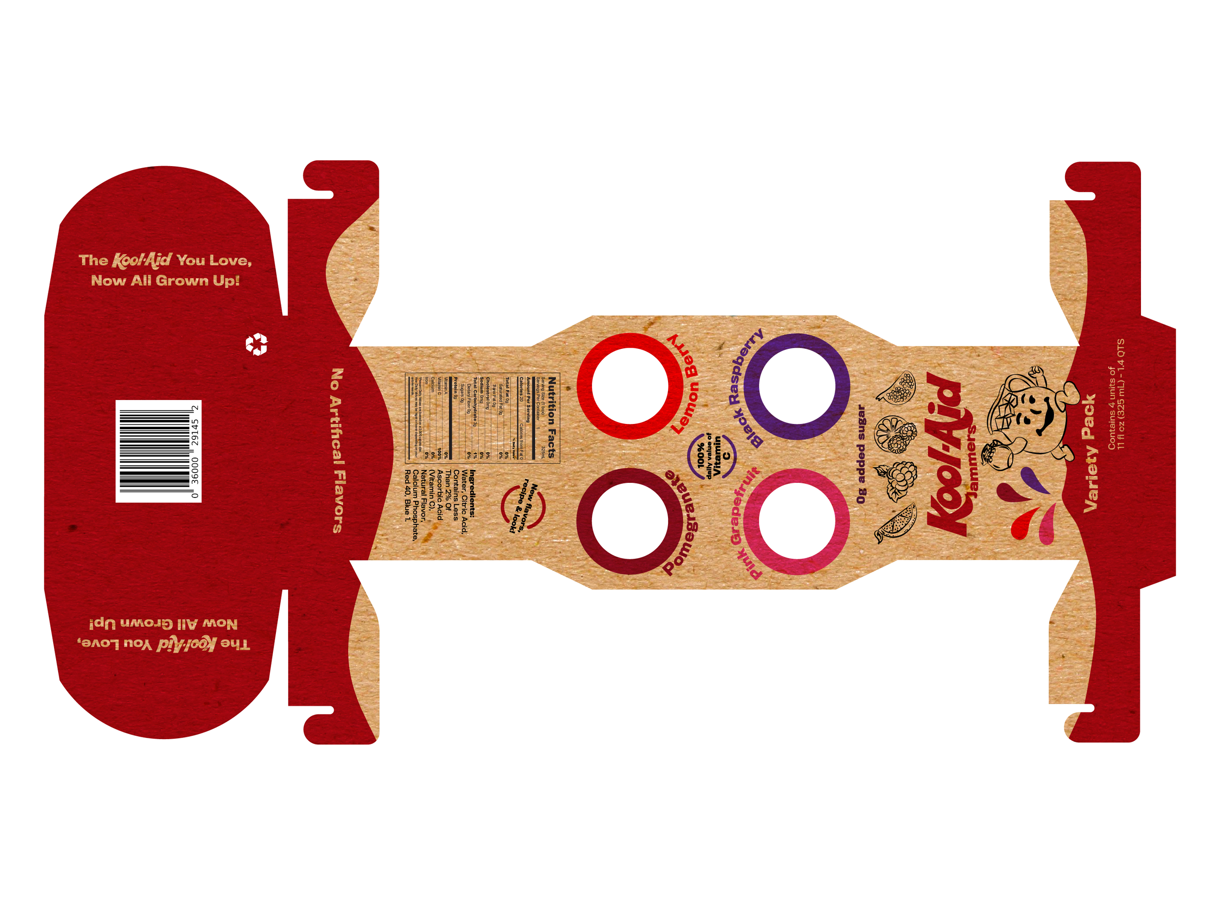
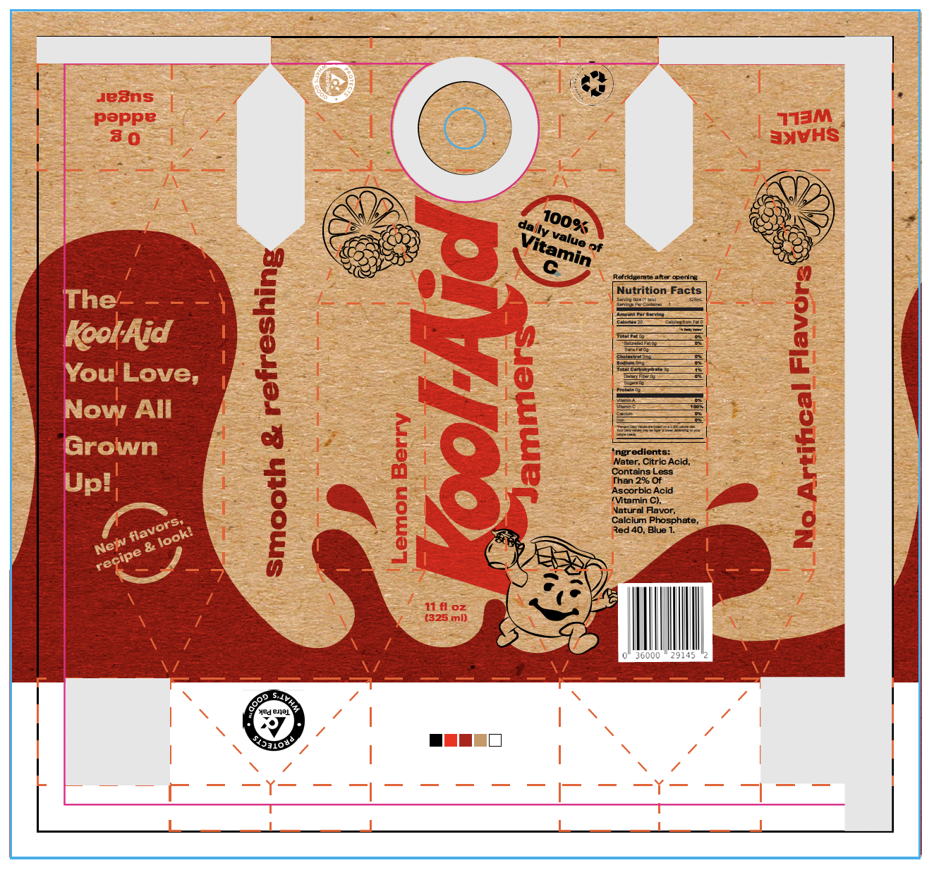
What would it be like if Kool-Aid Jammers were marketed towards millennials? The desires of this new audience would shape the Kool-aid brand to be completely new and different. With this project, I worked to design a jammers bottle and variety packaging to be in sync with the needs and wants of millennials. I focused on highlighting the health benefits of kool-aid with Vitamin C, changing the recipe to a less sugary drink and marketing the package with a recyclable, worldly feel. I also changed the flavors to be suitable and appreciated by a more advanced palate.
PROCESS
I started by creating 2 brand keys. One to really understand Kool-aid Jammers current market, and a second to brainstorm and solidify a new market for this drink.
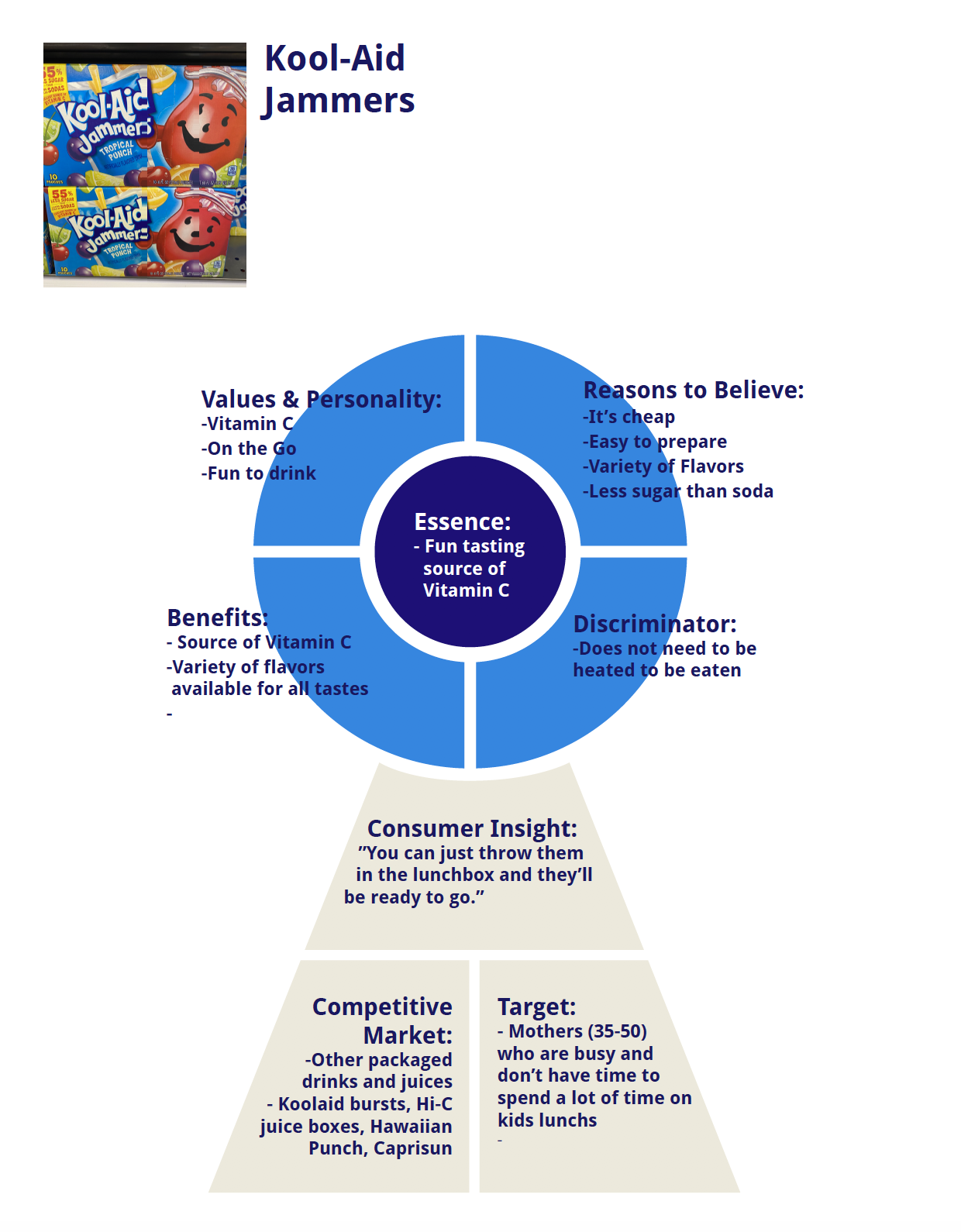
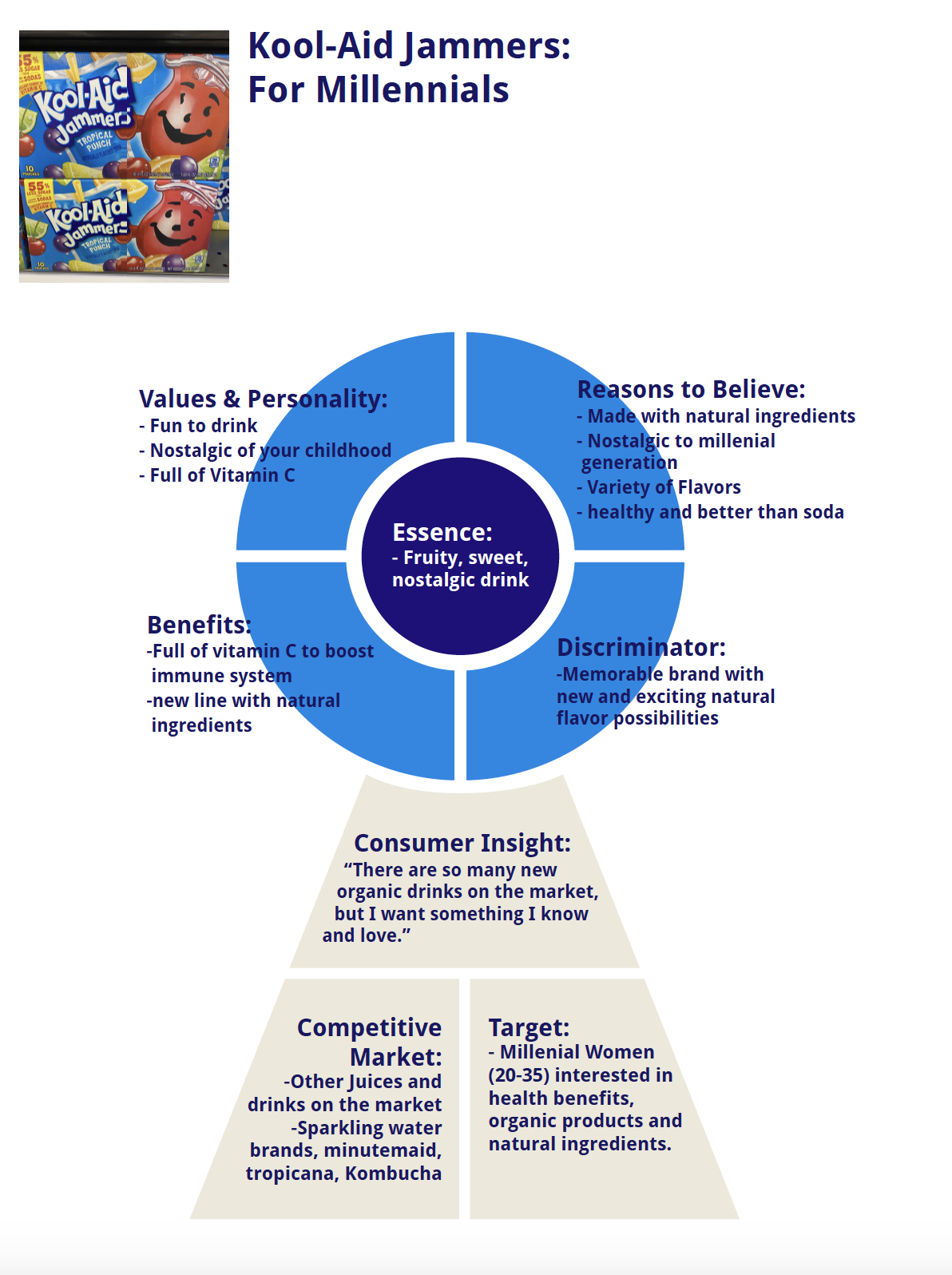

I then created a moodboard to hone in on the design style that would best fit this new, millennial market. These decisions were based on research done at the grocery store to see what other packages were doing to target a millennial audience. That includes using recycled materials, natural ingredients and a more muted color palette.
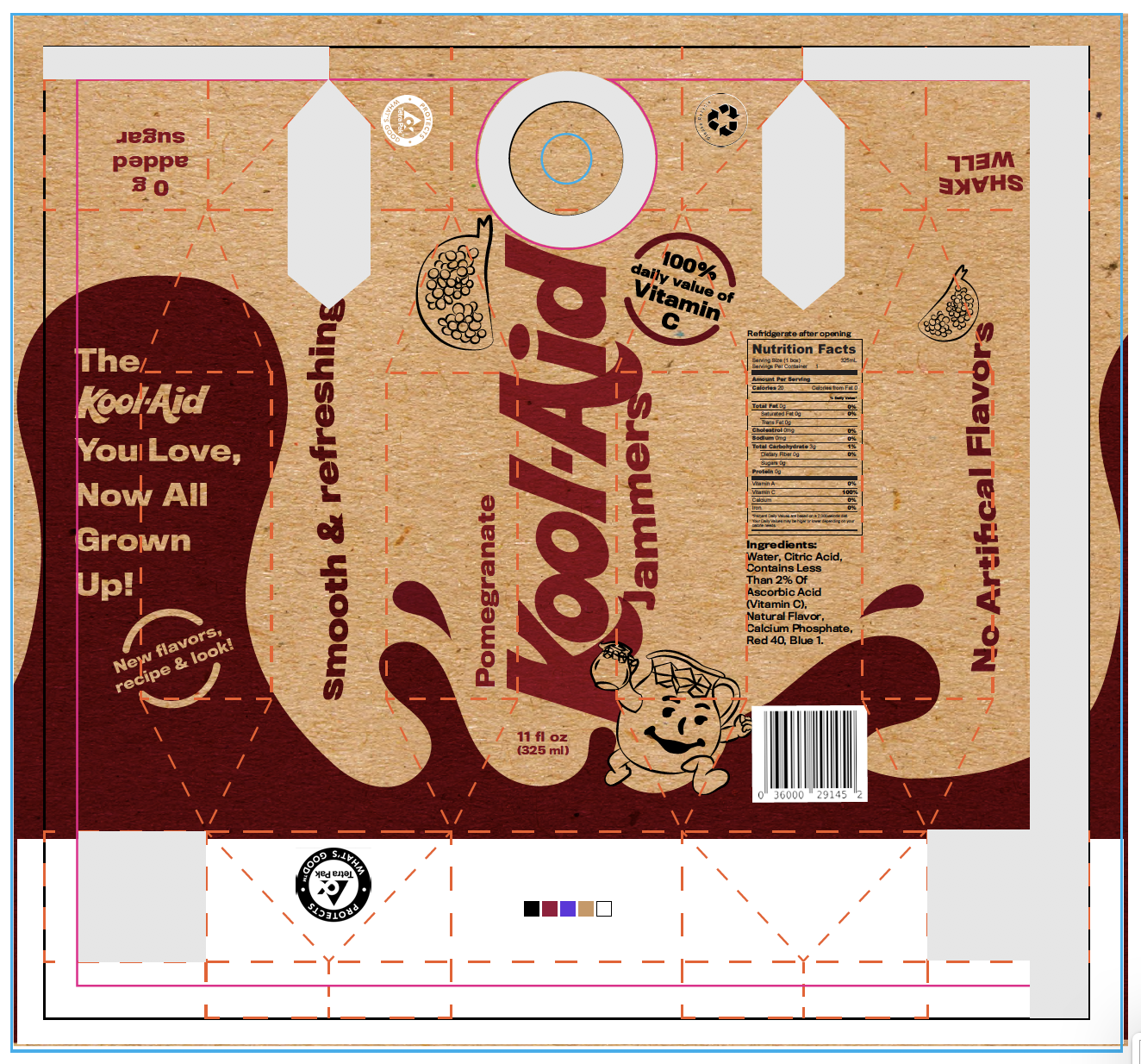
With the creation of a product dieline for both the drink container and the variety package, I designed the new Kool-Aid Jammer packaging to be attractive and inviting to my chosen audience.
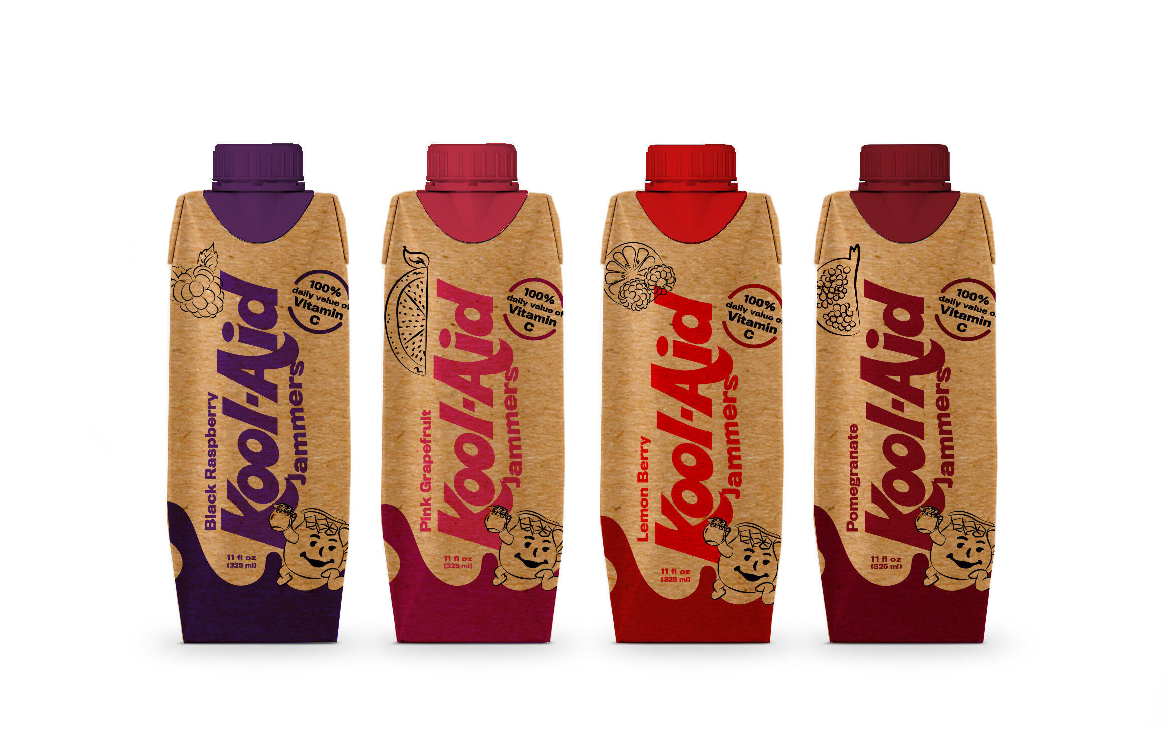
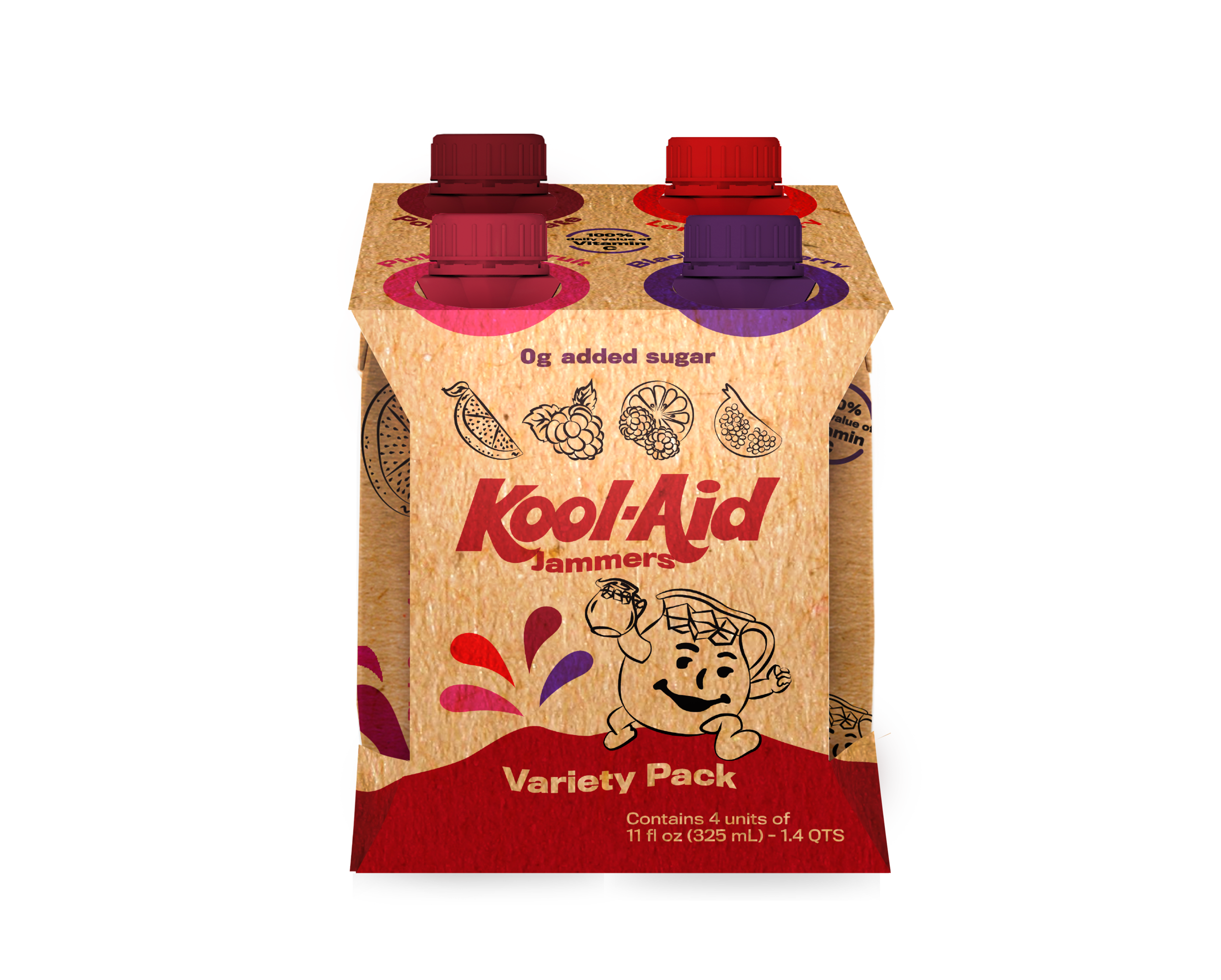
The mockups depict what the new packaging will look like when brought to shelf.


