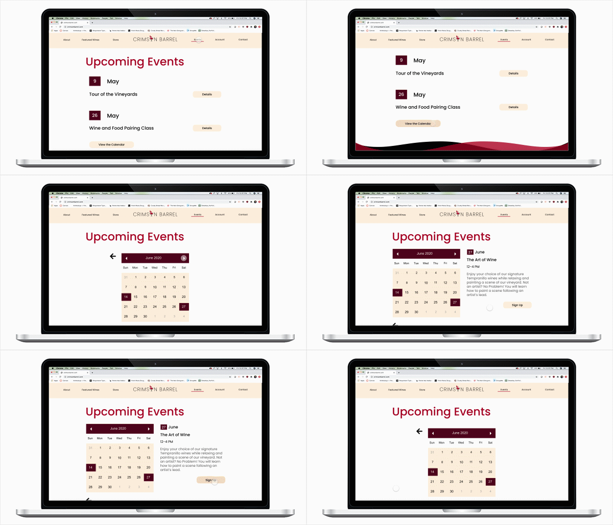
Crimson Barrel Interface

Crimson barrel
winery & vineyard
CLIENT
New Wine Company
DESIGN TYPE
Branding, Packaging and Interface Design
ROLE
Designer, Researcher
AUDIENCE
People over 21, interested in wine
SUMMARY
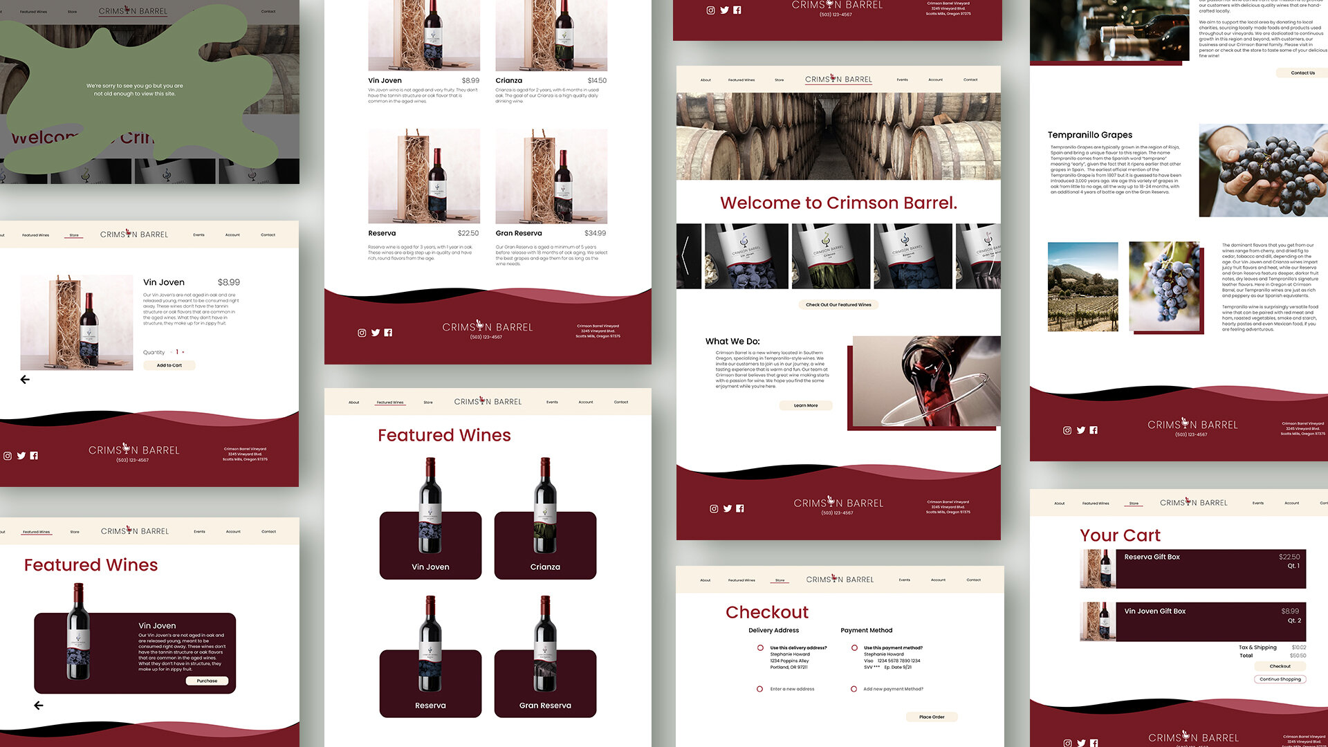
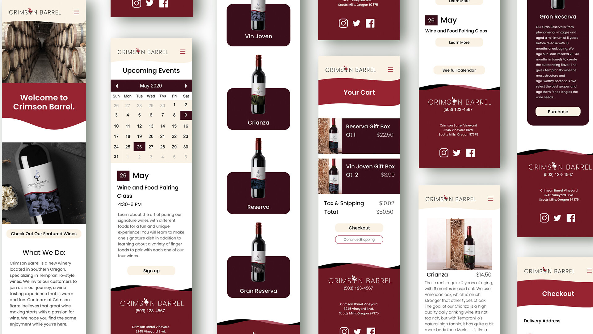
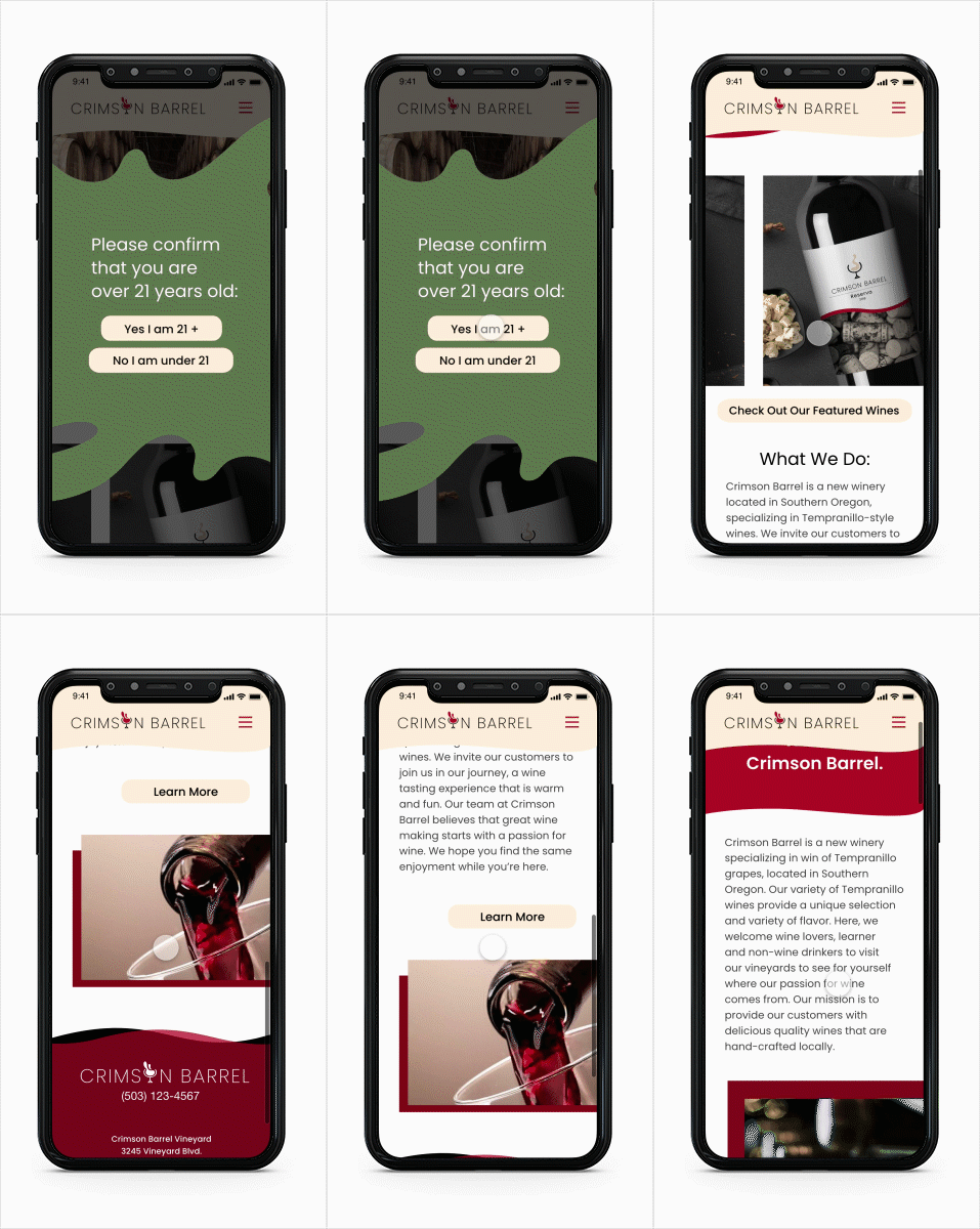
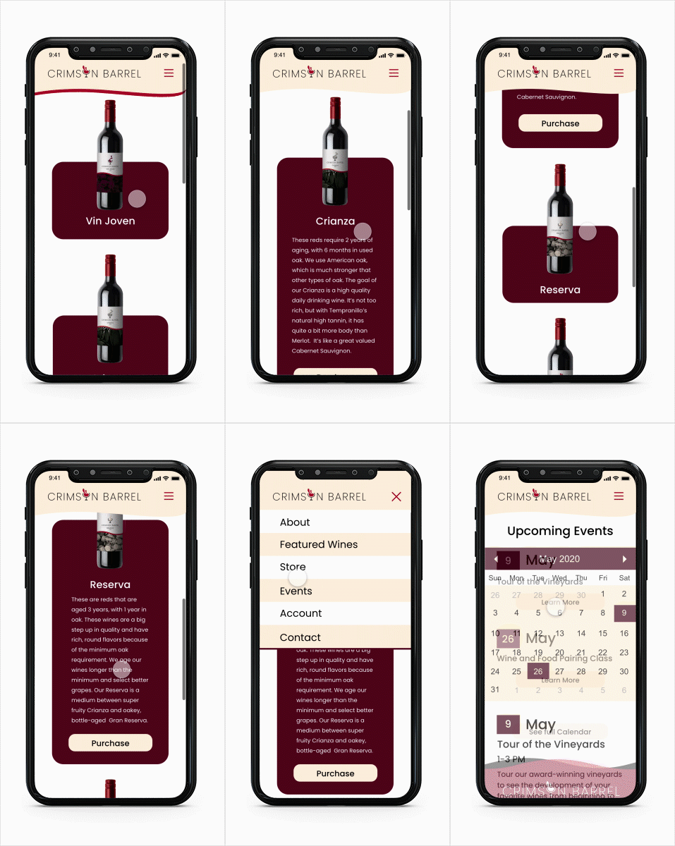
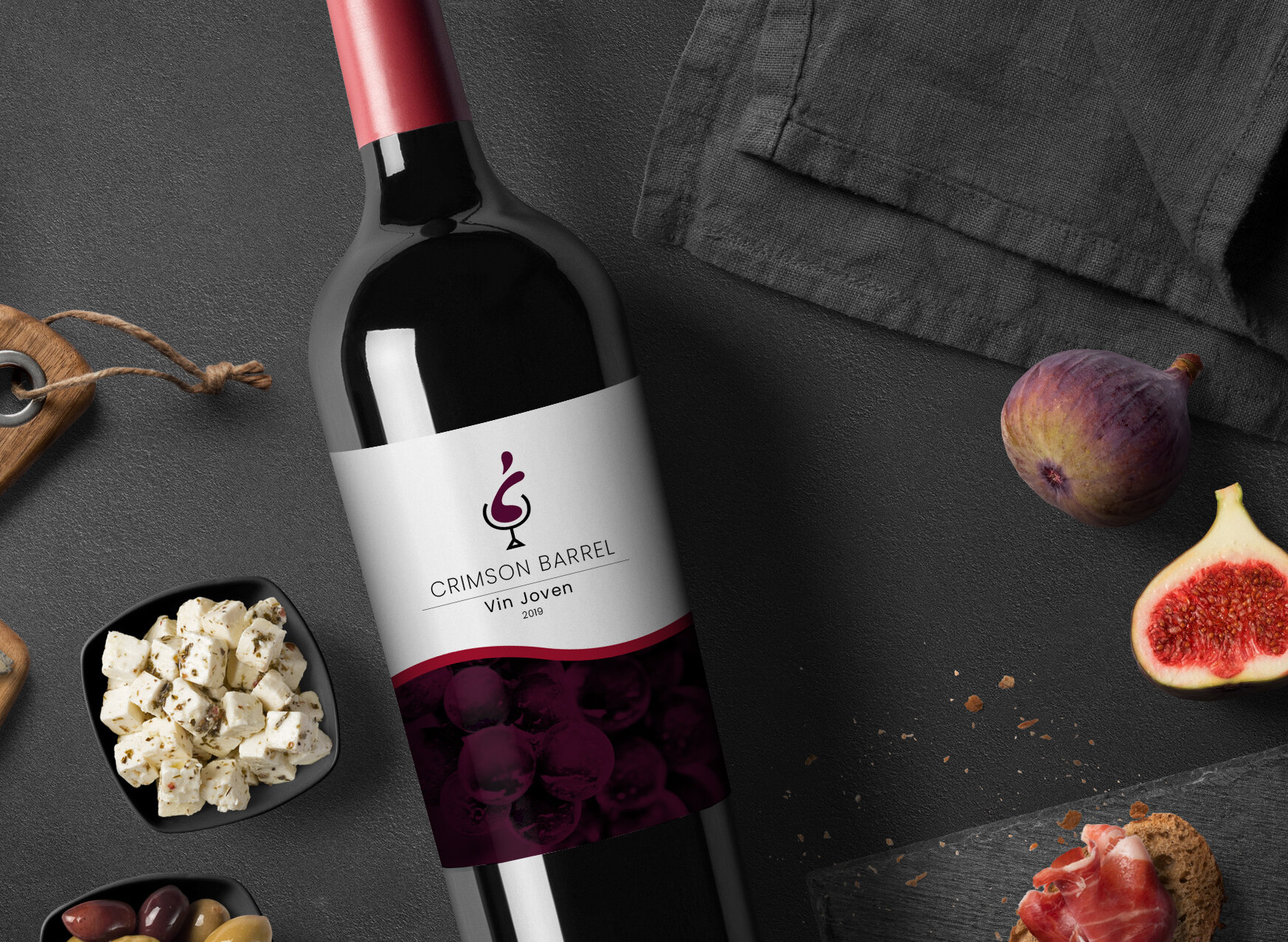
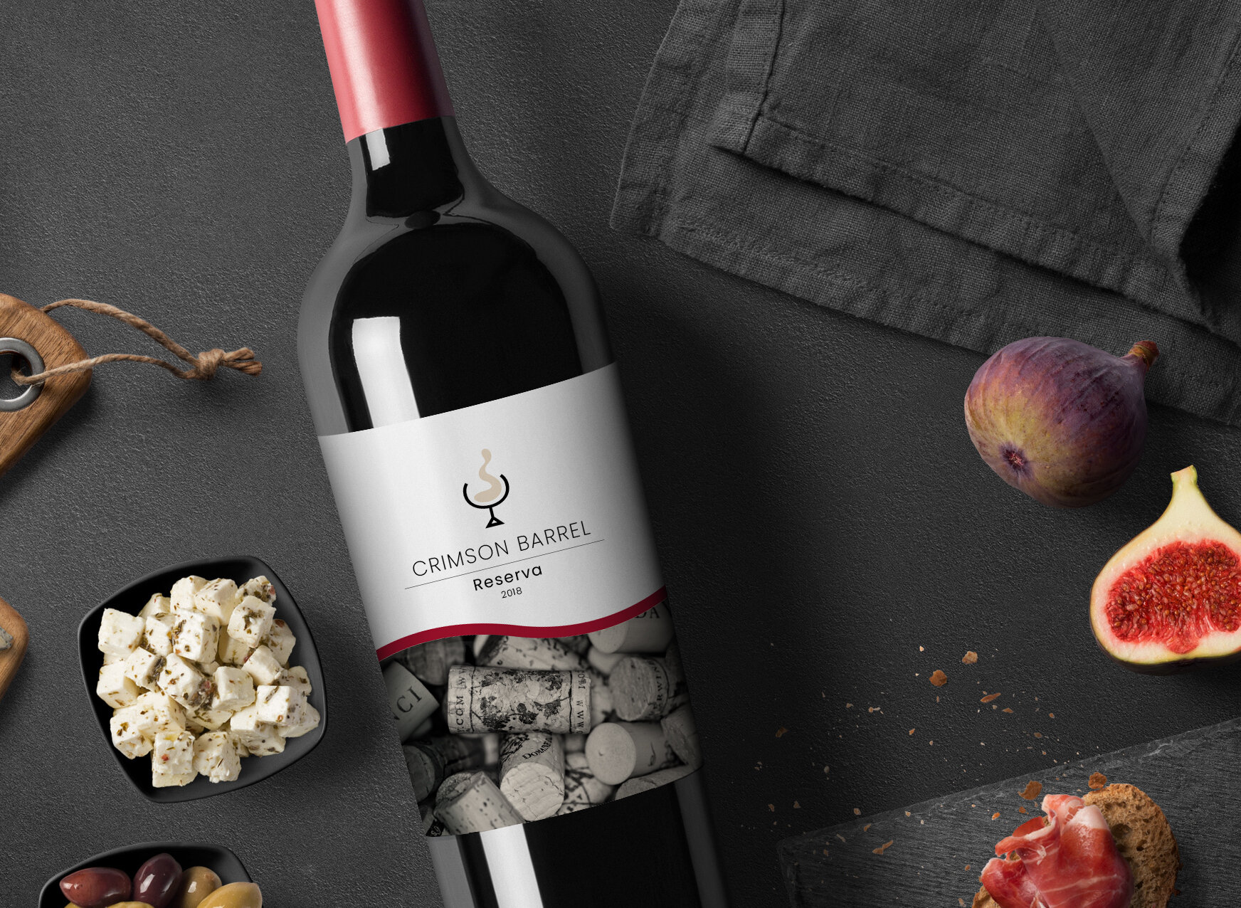
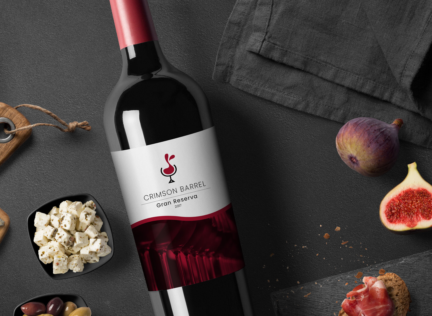
In a mock scenario, I was approached by a fine wines company to design a digital interface for their new brand. The company would be located in Southern Oregon, with a specialization in red wines, specifically Tempranillo-style wines. To expand this new business, I sought out to design a full package for their site launch. I developed a persona and brand/labels for the wine, and implemented it into a full web and mobile site application. In addition to that, I designed the logo for the company, along with the wine bottle labels for a set of 4 Tempranillo Red wines.
PROCESS
To begin the design process, I created a persona to further define and explore the ideal audience for this wine company. My ideal audience includes people who are young adults, with an interest in healthy living and supporting more local, small businesses. I also wanted to gear this business to people who are interested in purchasing and learning about wine online as well as visiting the actual winery itself. All of these features are demonstrated through the research and design put into the digital interface.


I created the logo based on a minimalist, warm aesthetic that was translated through the client brief. The “o” in Crimson also stands as a pictorial mark that is flexible in various applications. With the design of the logo and development of a color palette, I implemented the new brand into a styleboard to follow for the development of the wine bottle labels and website.

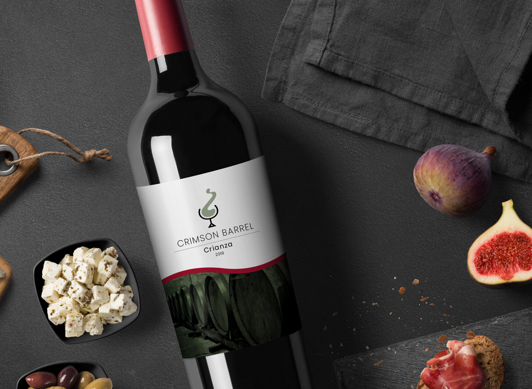
The wine bottle labels are simple in their design to match the aesthetic of the website. Each one is differentiated by the flexible logo, color and image.

To develop the website interface, I started with a Site Map, in which I layed out my pages and began to establish the flow of the site.
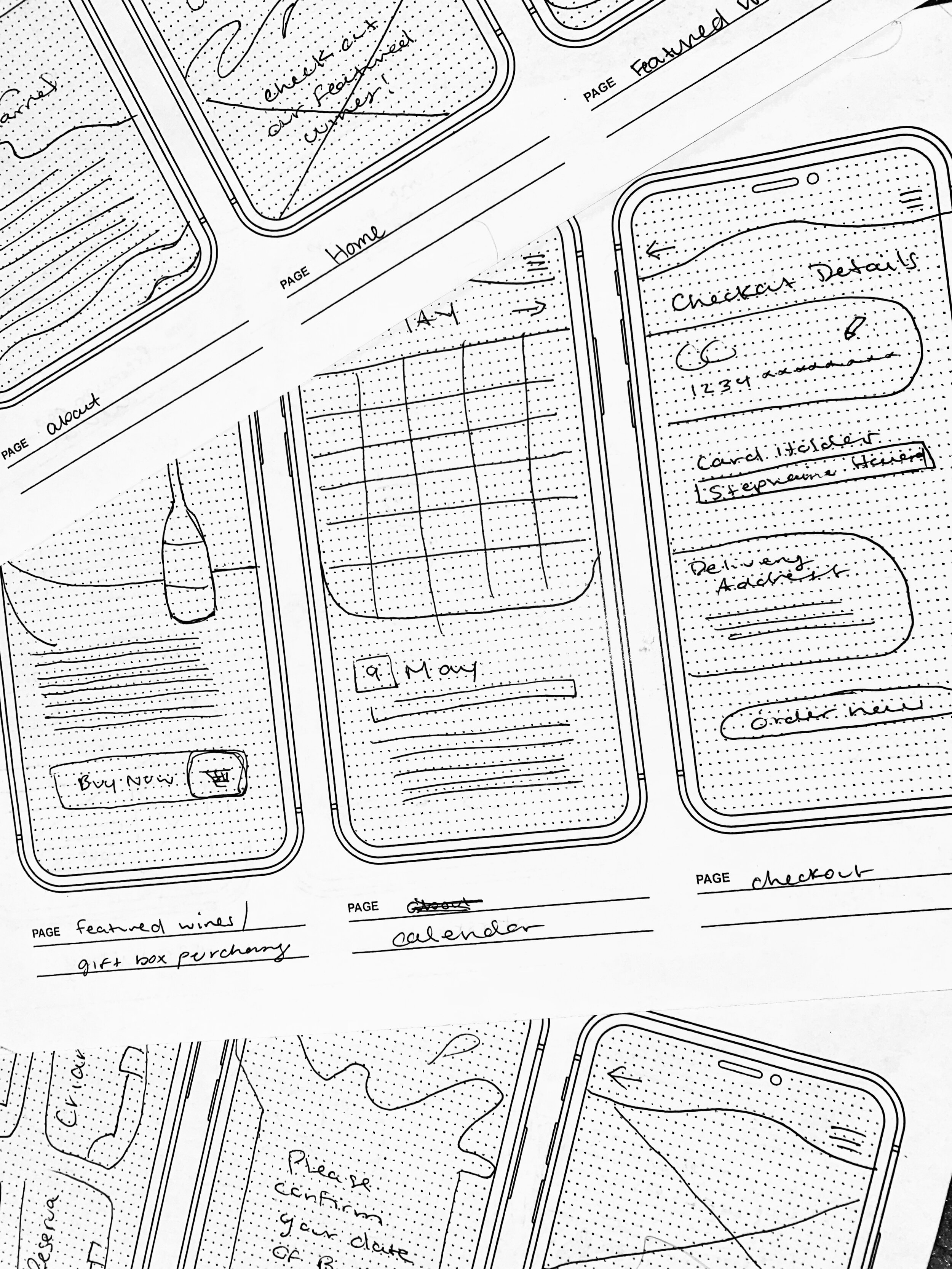
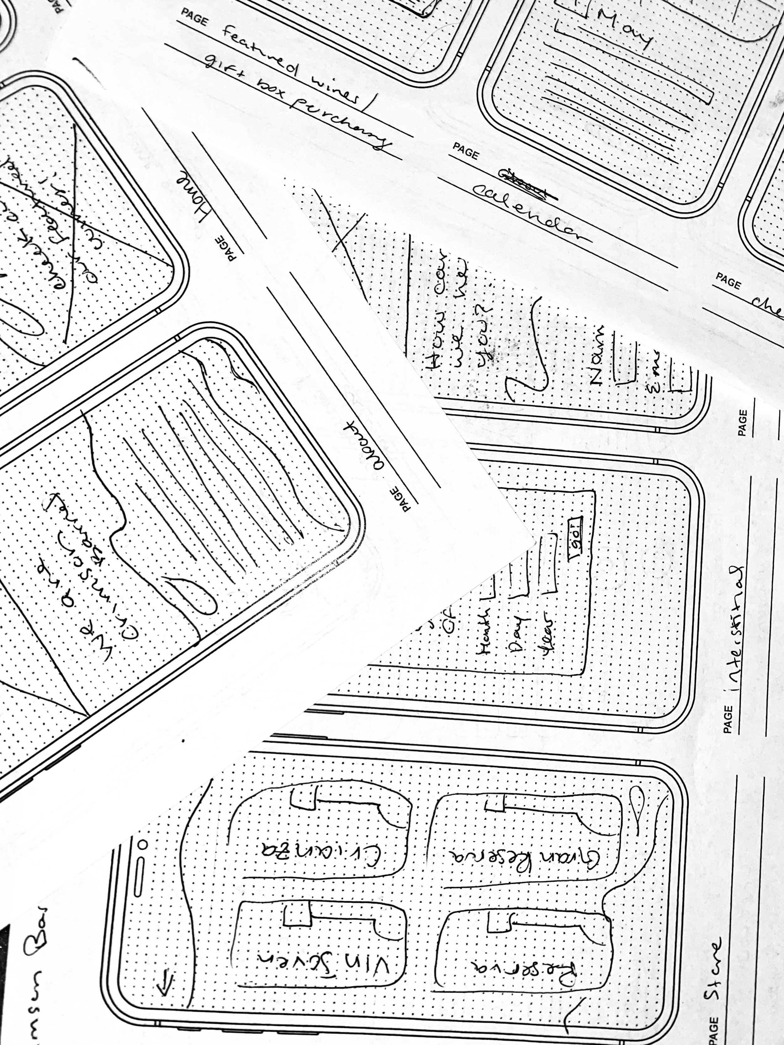
Following the creation of my site map, I started to sketch rough ideas for the design of the site, starting with a mobile format.
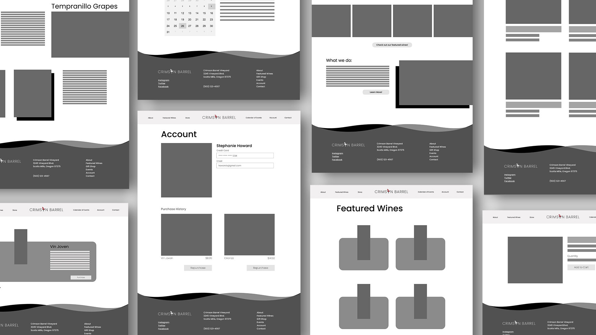
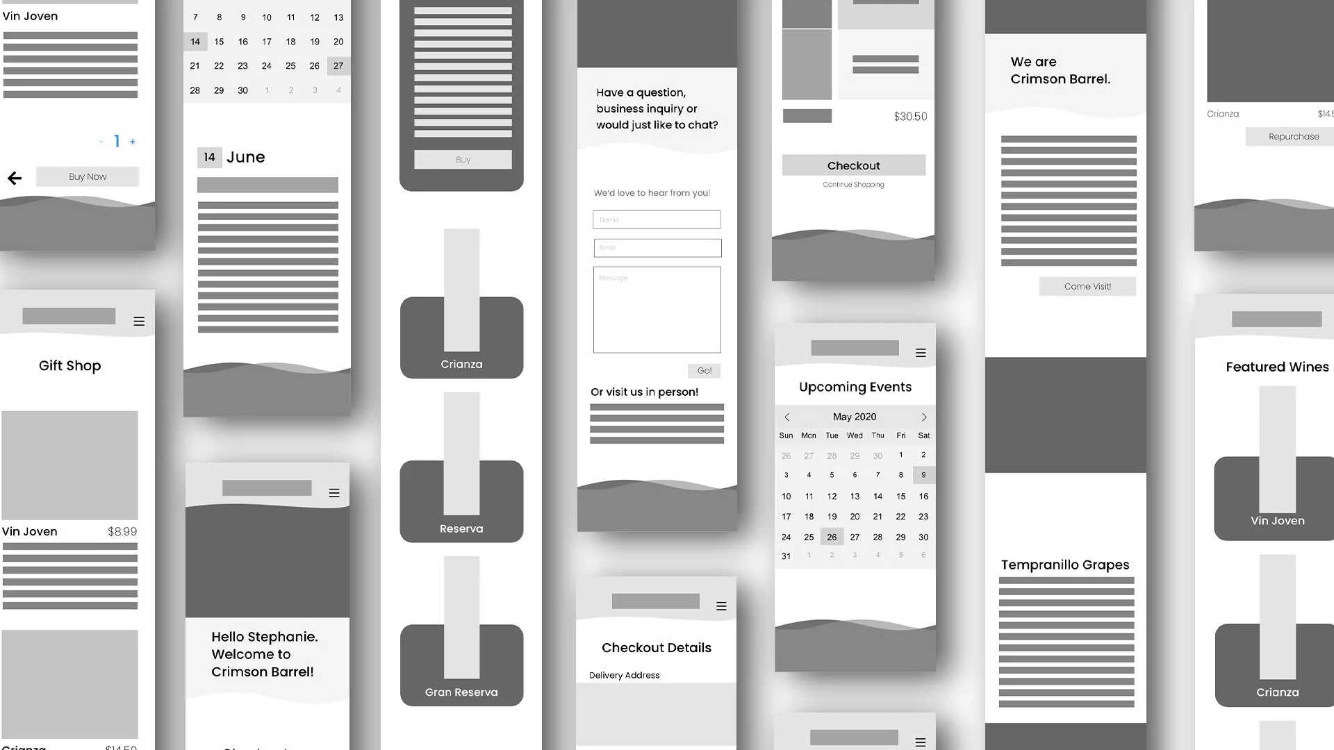
I further planned the layout, function and features of the mobile and desktop version of the website by creating black and white wireframes. It was important to me to make sure that even though this was a mockup, the site would flow correctly and be consistent between desktop and mobile versions.
To complete the project, I developed the full website, including all pages and the functionality between pages.
