
Gill Sans Poster

Gill sans
Poster & Booklet design
CLIENT
Mock Just My Type Exhibition
DESIGN TYPE
Print Design, Poster Design
ROLE
Single Typeface Researcher, Designer
AUDIENCE
People interested in learning about the history of typography
SUMMARY
As a group, me and my fellow classmates put together an exhibition about the history of different typefaces and typeface designers called Just My Type. I personally created a poster and brochure set that tells the story of Gill Sans and it’s creator, Eric Gill. Through my research into Gill Sans, I found that Eric Gill’s inspiration for the creation of the letters came from geometric shapes, combined with natural calligraphic marks. This inspired my idea for the poster and the way in which the user can read the brochure. The design of the brochure allows you to choose what you would like to learn about first, the typeface or the person.
PROCESS
I started the design process with research into the typeface, Gill Sans and the man, Eric Gill. From there, I sketched out many different ideas for the poster.
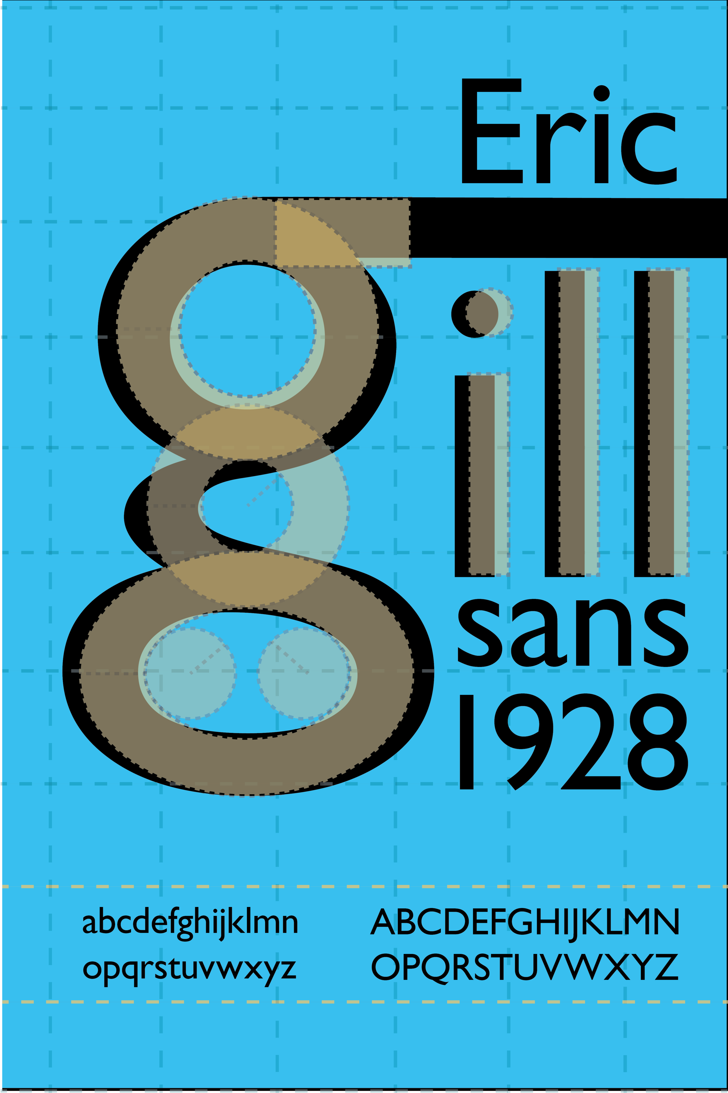
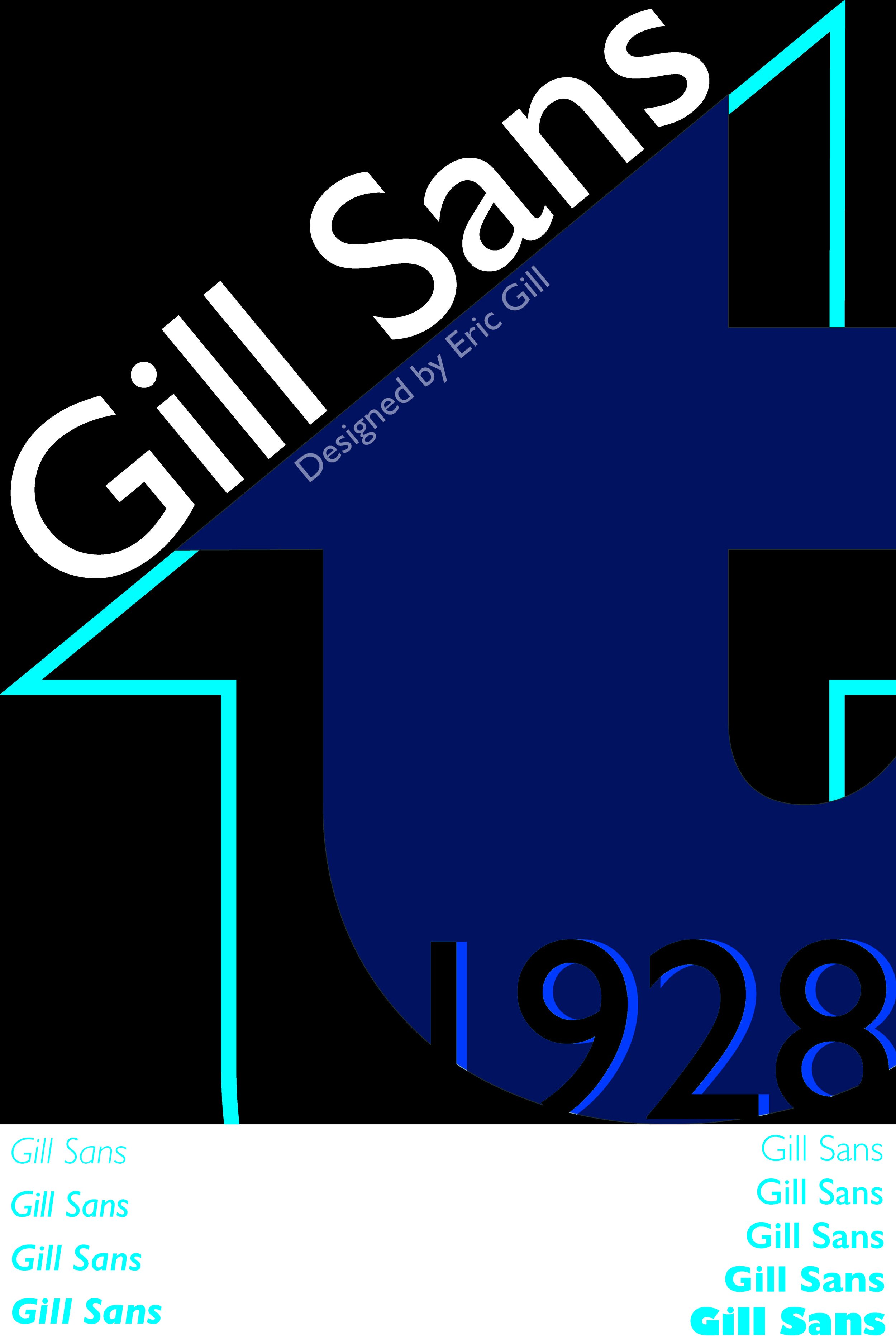
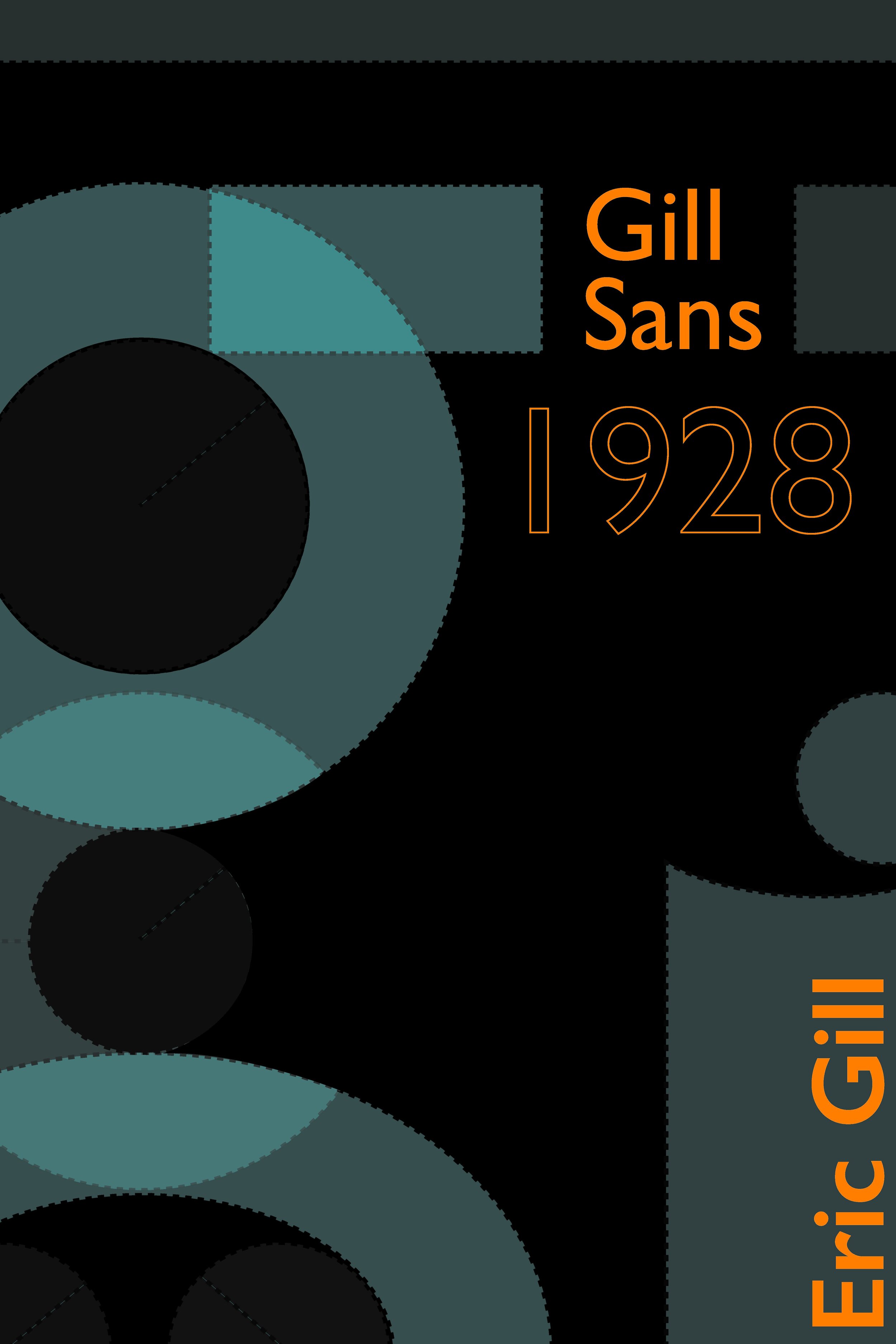
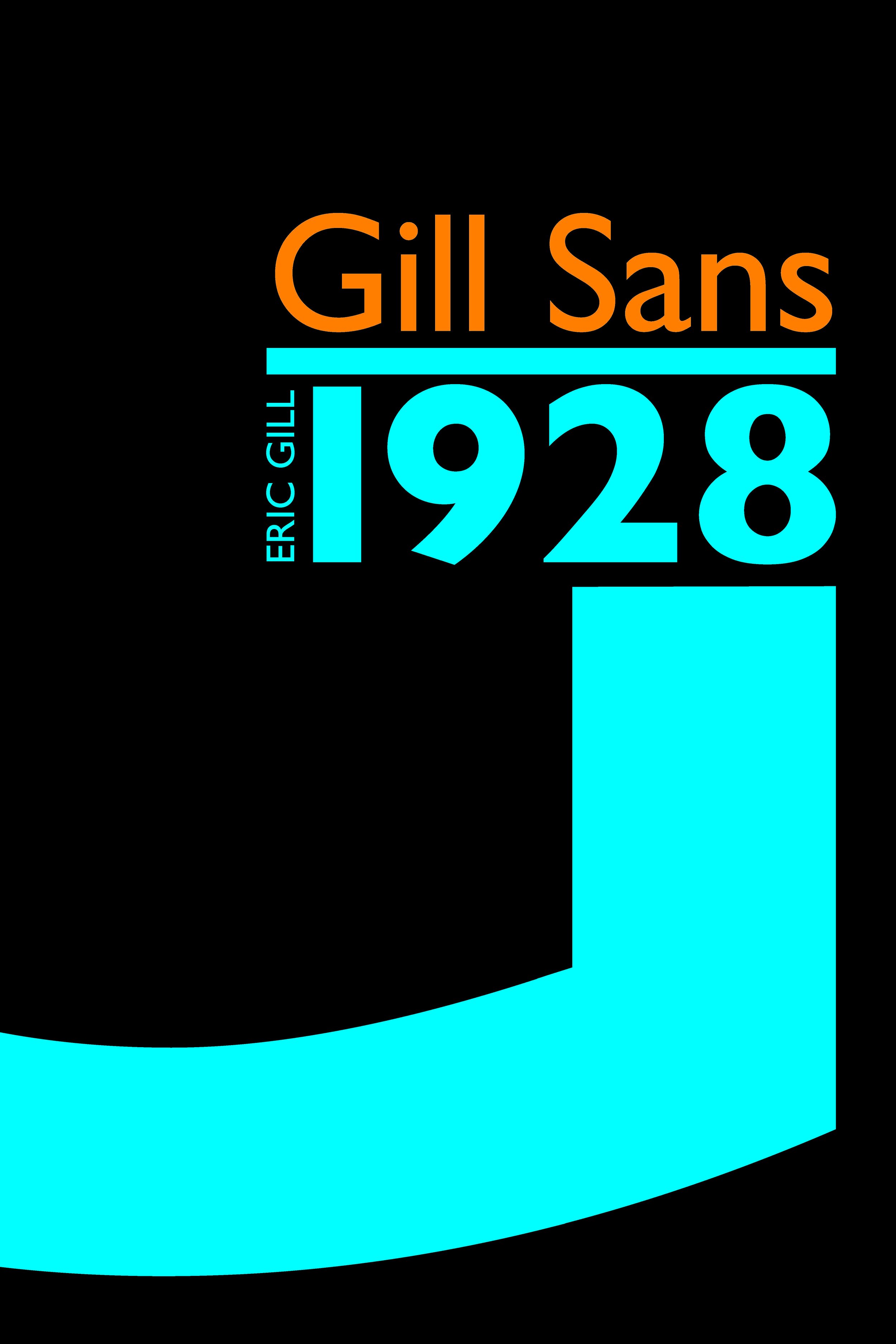
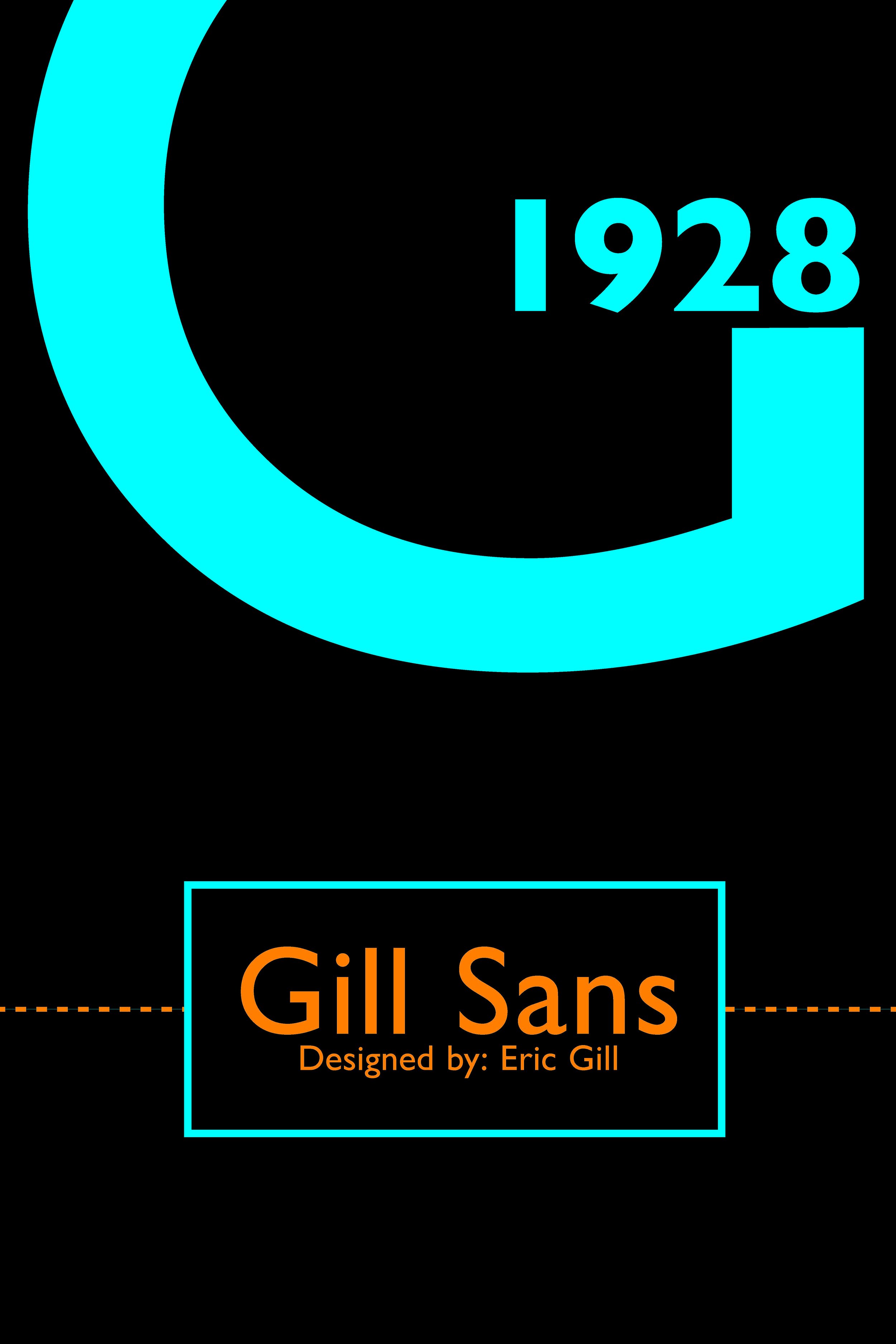
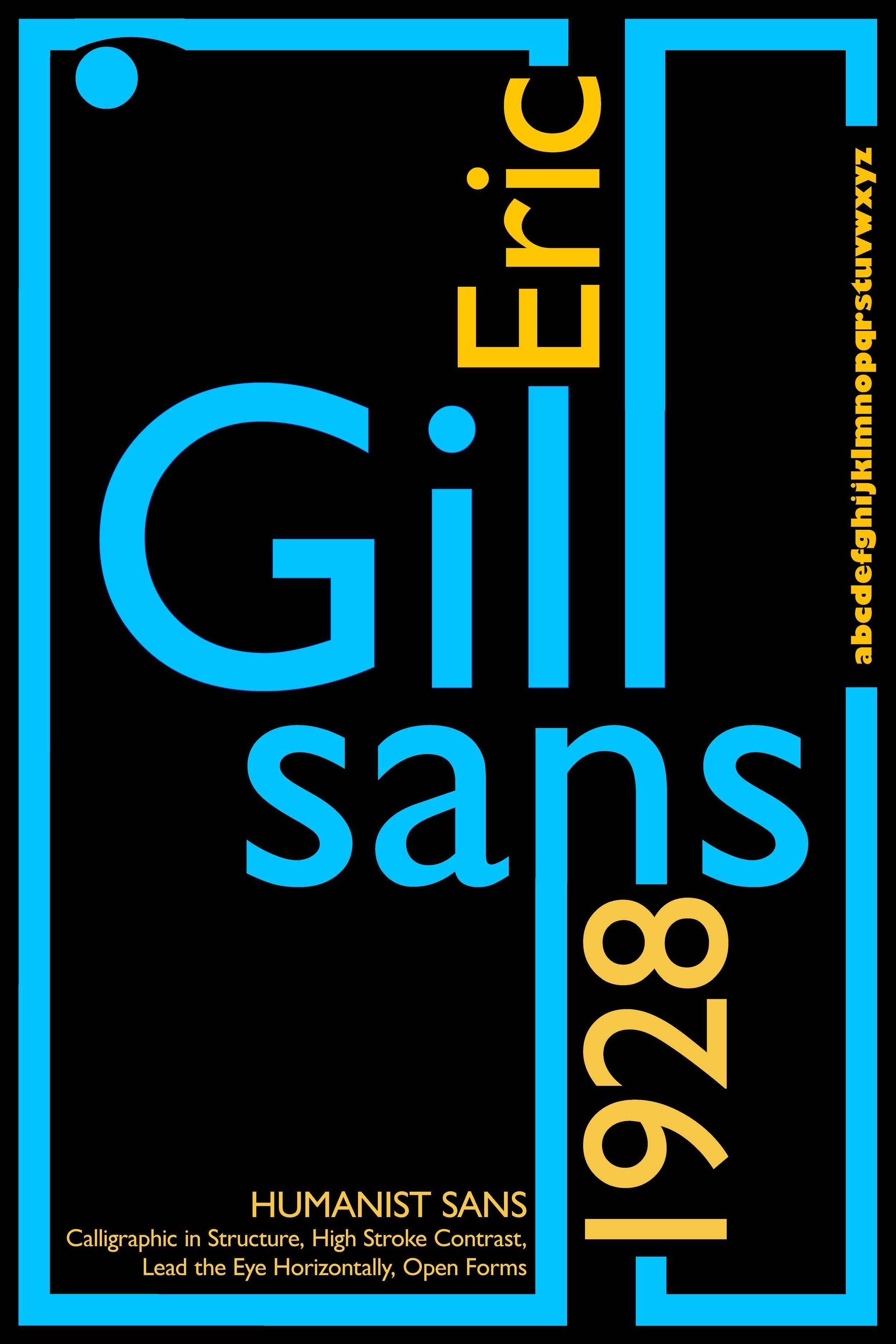


Following my sketches, I had a number of different digital first drafts playing with the variety of shapes in the characters and settled on the simple geometric shapes that make up a lowercase “G”.
In the final design, I used the “G” to bring in viewers from far away and smaller text to give more detail and entice the user to want to read more in the brochure.


